The municipality of Tervuren is located in the Flemish province of Flemish Brabant. Tervuren is known by most people for it’s unique Museum for Central Africa, an ethnographical and natural history museum focused on Central African history and culture. Tervuren is a lively town with a rich history, still visible today. Connected to Brussels by a large boulevard, yet surrounded by a large forest and a beautiful park, it’s location is just gorgeous. This, combined with a great cultural offering makes Tervuren a great place to live.
We teamed up with the local government to create a visual branding that reflects the unique character and the quality of living in this community. Working closely with the marketing and communications team, we developed a strong and coherent brand communication system that transforms the organizational structure and service of the local government into a tangible brand experience. We needed to develop a brand system that could be applied internally by the municipalities’ communications department.
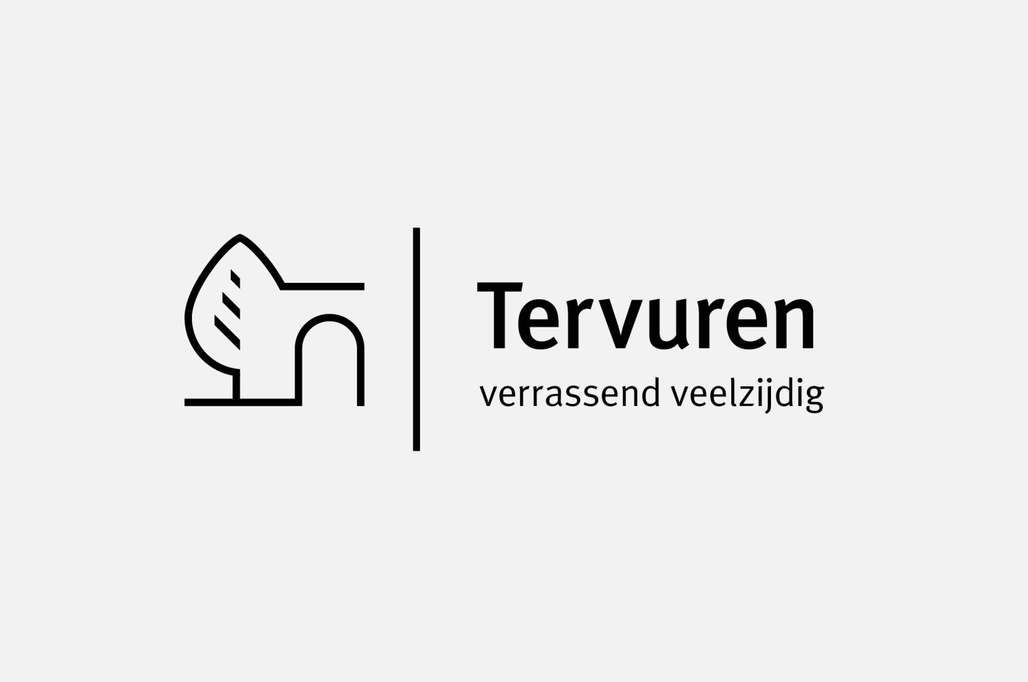
We started out with redesigning the existing logo and scraping away all the clutter to keep a contemporary and timeless logo that remains familiar. From the logo we then took detailed graphical elements to build a visual system that reflects the service structure of the local government, build on three pillars: Life, People and Space. To each pillar we applied different graphical parts of the logomark and combined this with a specific colour scheme. In doing so we provided a visual brand experience for the citizens of Tervuren that connects emotionally with each service level. By basing the visual system on the logo the overall brand experience remains coherent when dynamically applied.
Because the client asked us to hand over the rebranding, to be applied internally, we needed a very workable visual system without compromising on the quality of the design. By making a clear and approachable visual system based on key elements and a clean-cut grid system the people who need to create the daily communication, are able to apply the branding with confidence and ease. The guiding brandbook we delivered is an everyday tool for them providing guidelines on all brand building blocks such as typography, colours, grid systems and much more. Also included in the brand book are designs for possible future applications that both provide inspiration and applied examples of the brand.
Branding Communication Strategy Art Direction Graphic Design
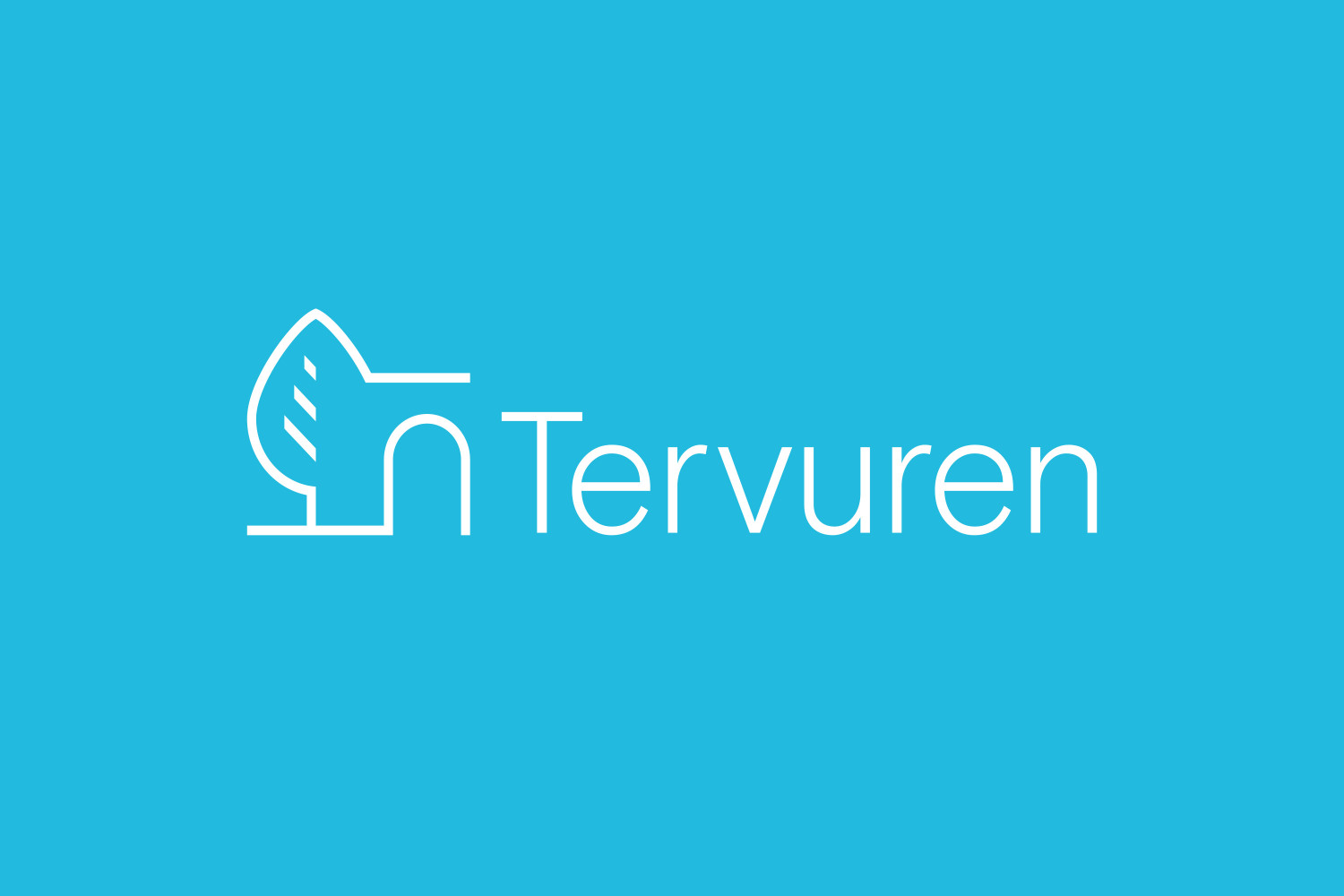
Before


By basing the visual system on the logo the overall brand experience remains coherent when dynamically applied.


