With the move to a brand new campus on the horizon, Antwerp Management School (AMS) was ready for a new visual identity system that reflects the unique mission, vision and values of this ‘future proof’ institution. Antwerp Management School is anything but a run-of-the-mill business school, but the brand lacked a clear voice to express its unique approach. Contradictorily even, AMS having a rather conservative and generic visual identity made their competitors stand out more vividly with little effort.
Extensive workshops with all business unit leaders helped us gain insight on the specific nuances in tone needed for the different target groups. A closer analysis of the overall brand architecture led us to eliminate all existing sub-logos and opt for a much more uniform umbrella identity. We proposed a complete re-branding that is highly identifiable and tailored to the future vision, preferring revolution over evolution and installing —at least formally— a complete break with the past.
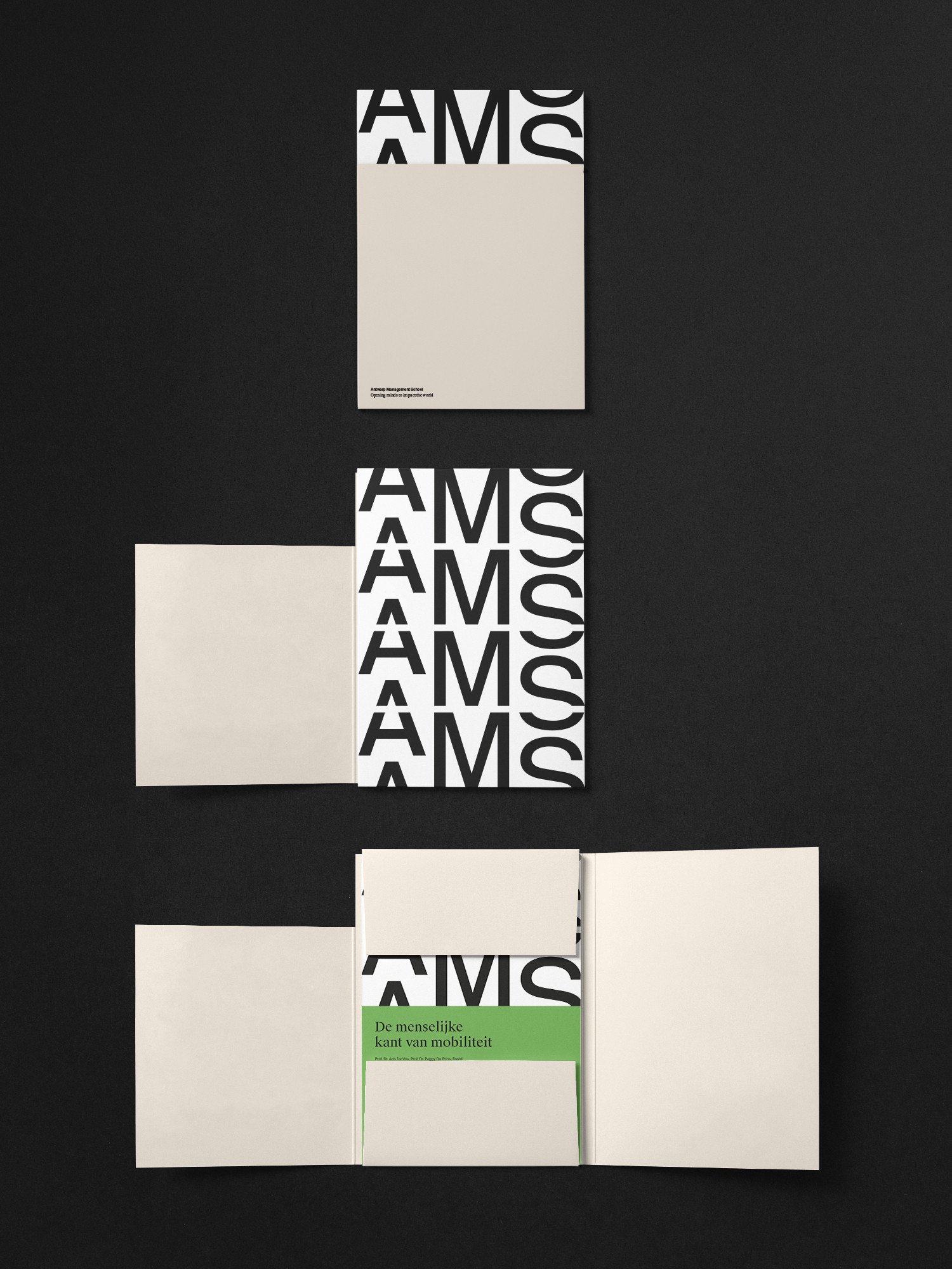
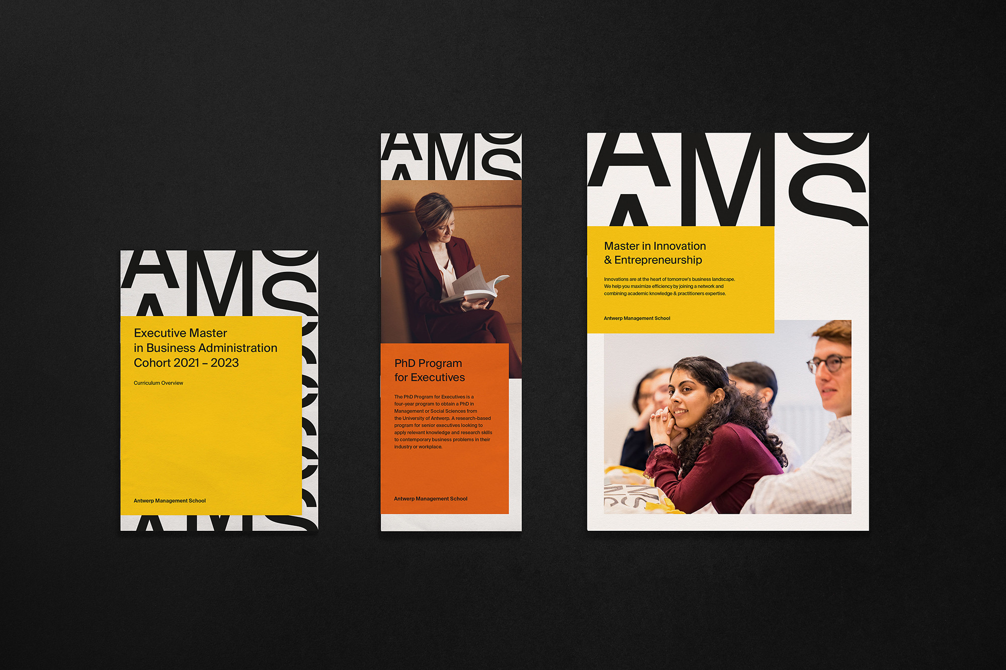
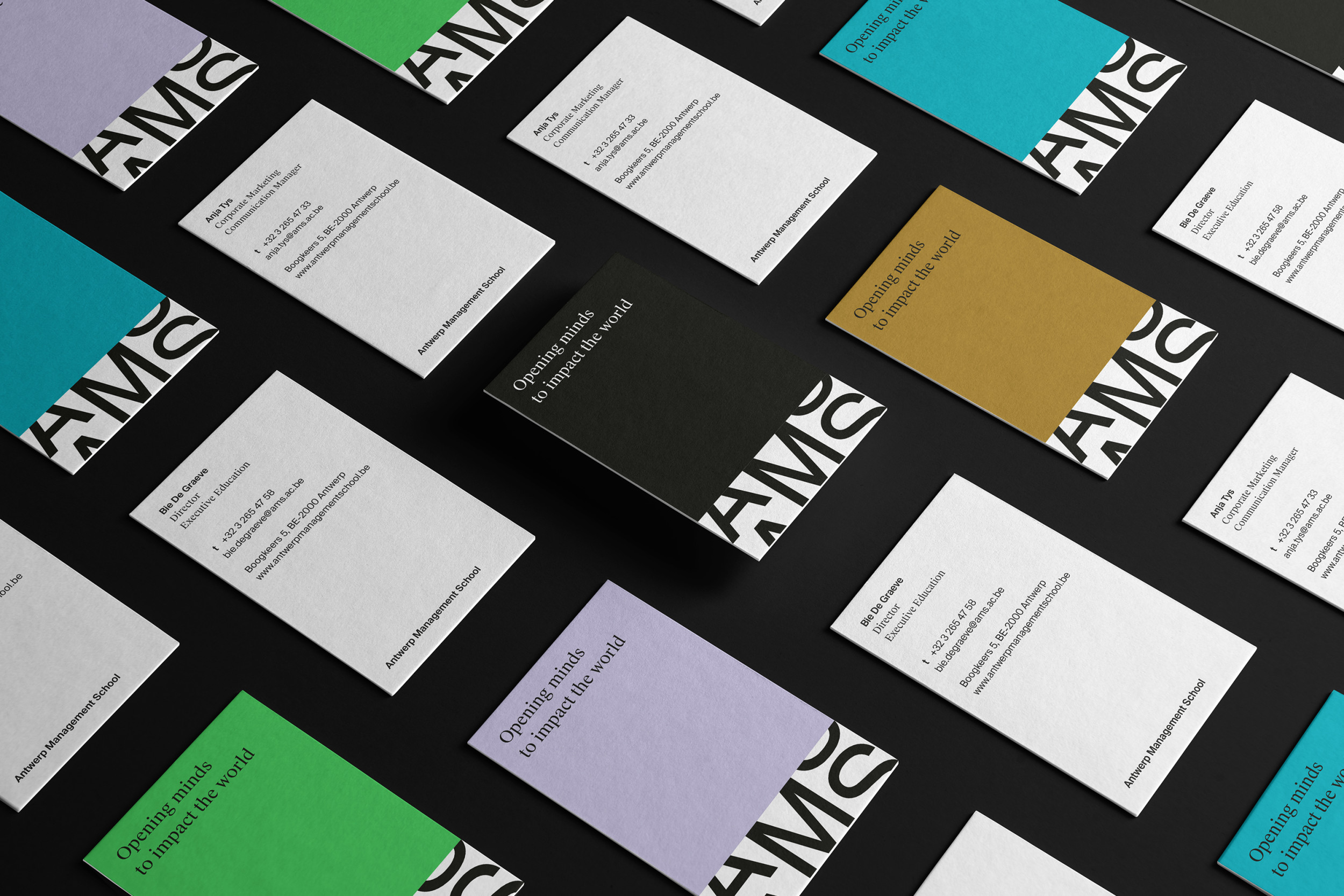
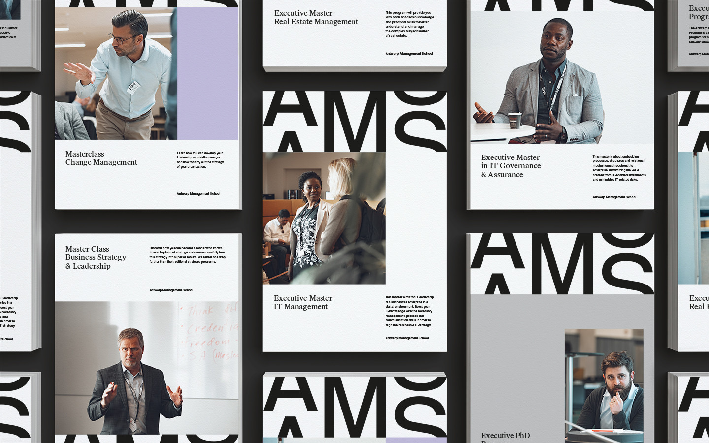
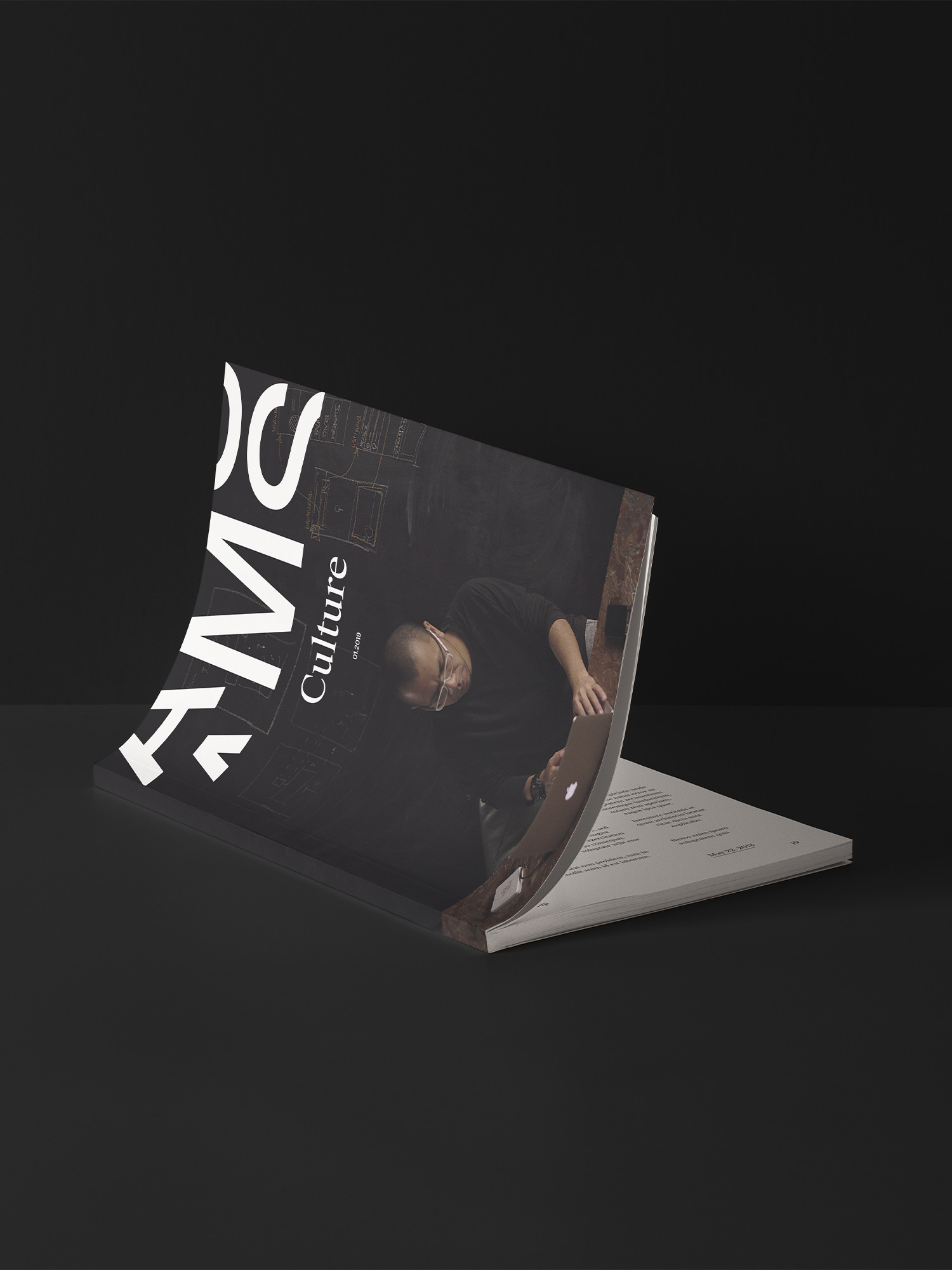
Imperative to our contemporary, dynamic approach is the new logo. The central M represents a solid basis while also symbolizing the competence of the Manager in an exceedingly more turbulent and transforming (business) world. The cut-off letters A and S not only represent this transformation, but also refer to an upward movement (arrow) and a the river running through Antwerp (De Schelde).
As an integrated visual element, the logo also becomes much more than a traditional wordmark. A the blueprint for a three-column grid applied throughout the entire system, it ensures remarkable brand recognition in a playful and dynamic way.
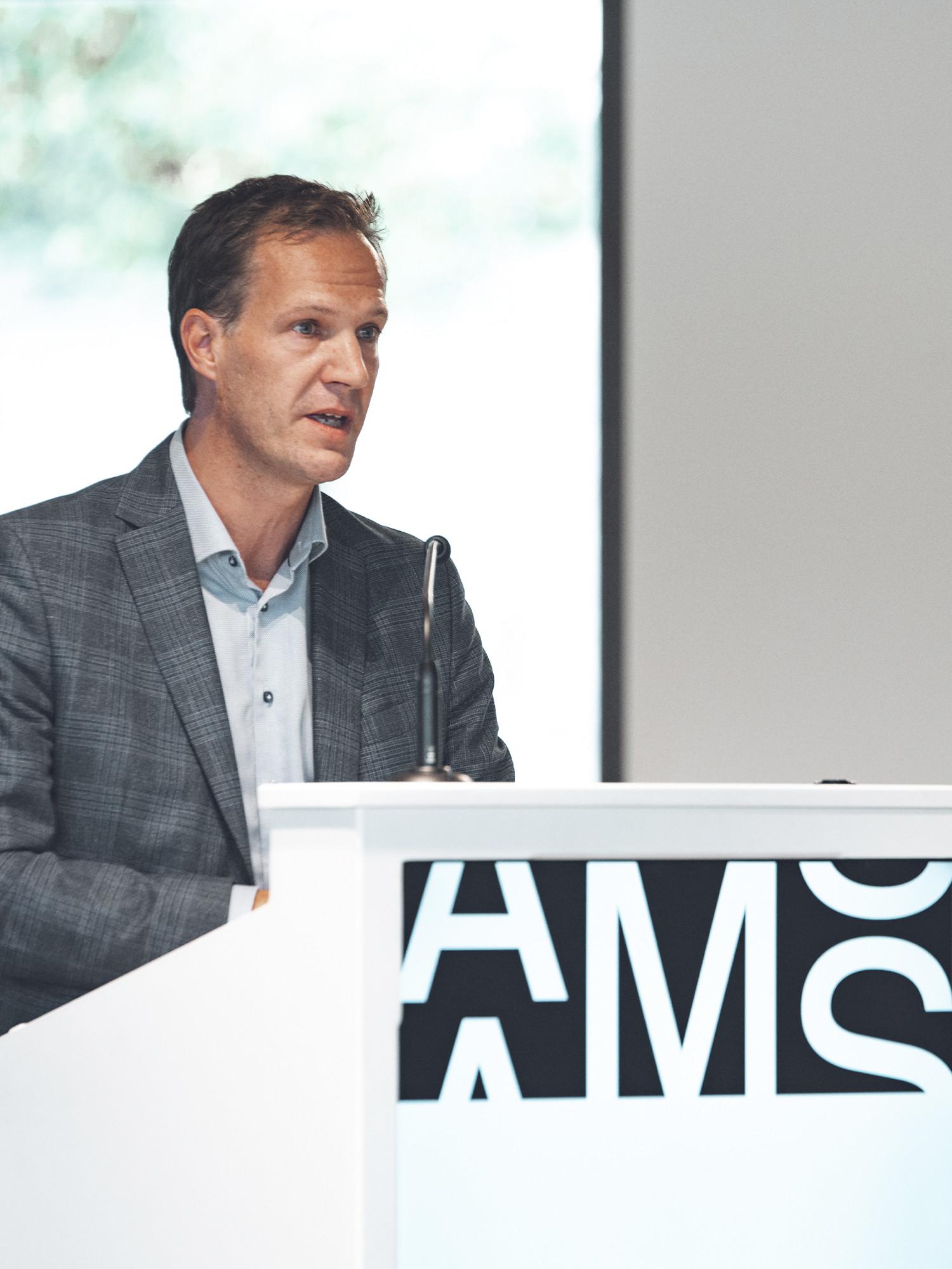
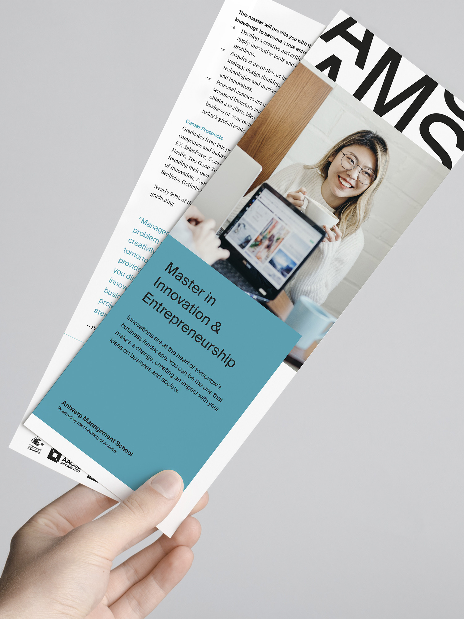
Photography by Martijn Fraanje.
Strategy Rebranding Brand Architecture Art Direction Graphic Design
Before


Transformation isn't just a buzzword at Antwerp Management School. It's in their DNA, it's their driver. Thus it became the driver of the new visual identity.