Antwerp has long been synonymous with fashion. Not because it follows trends, but because it continuously questions them. The Antwerp Six may have put the city on the international fashion map, but Antwerp fashion has always been more than a moment in history. It is an attitude. Quietly confident, intellectually curious and subtly rebellious.
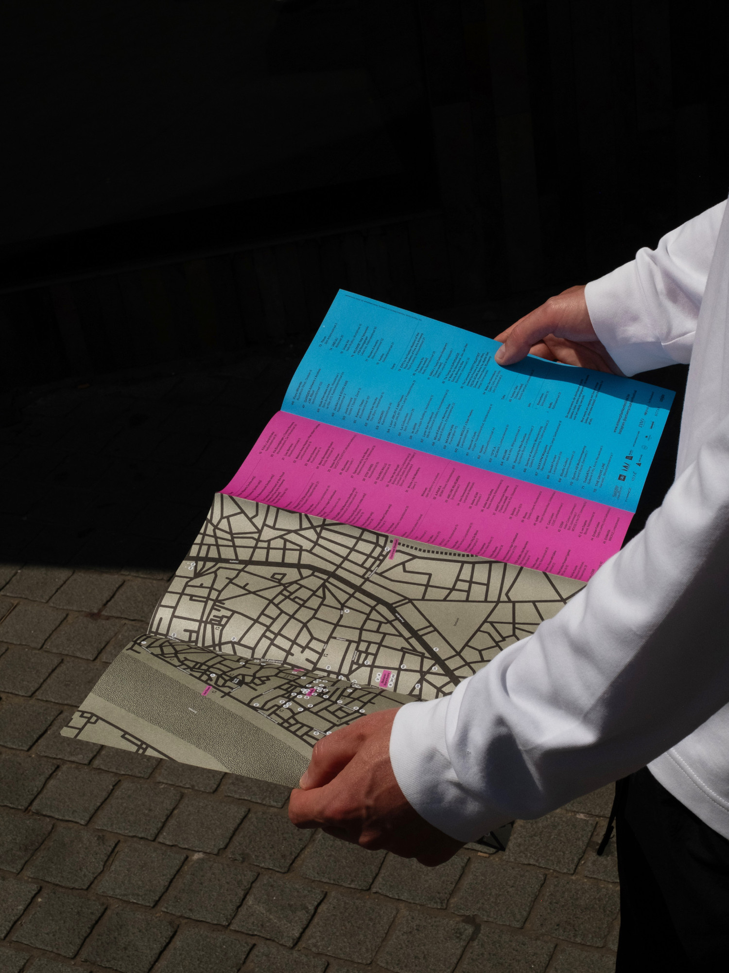
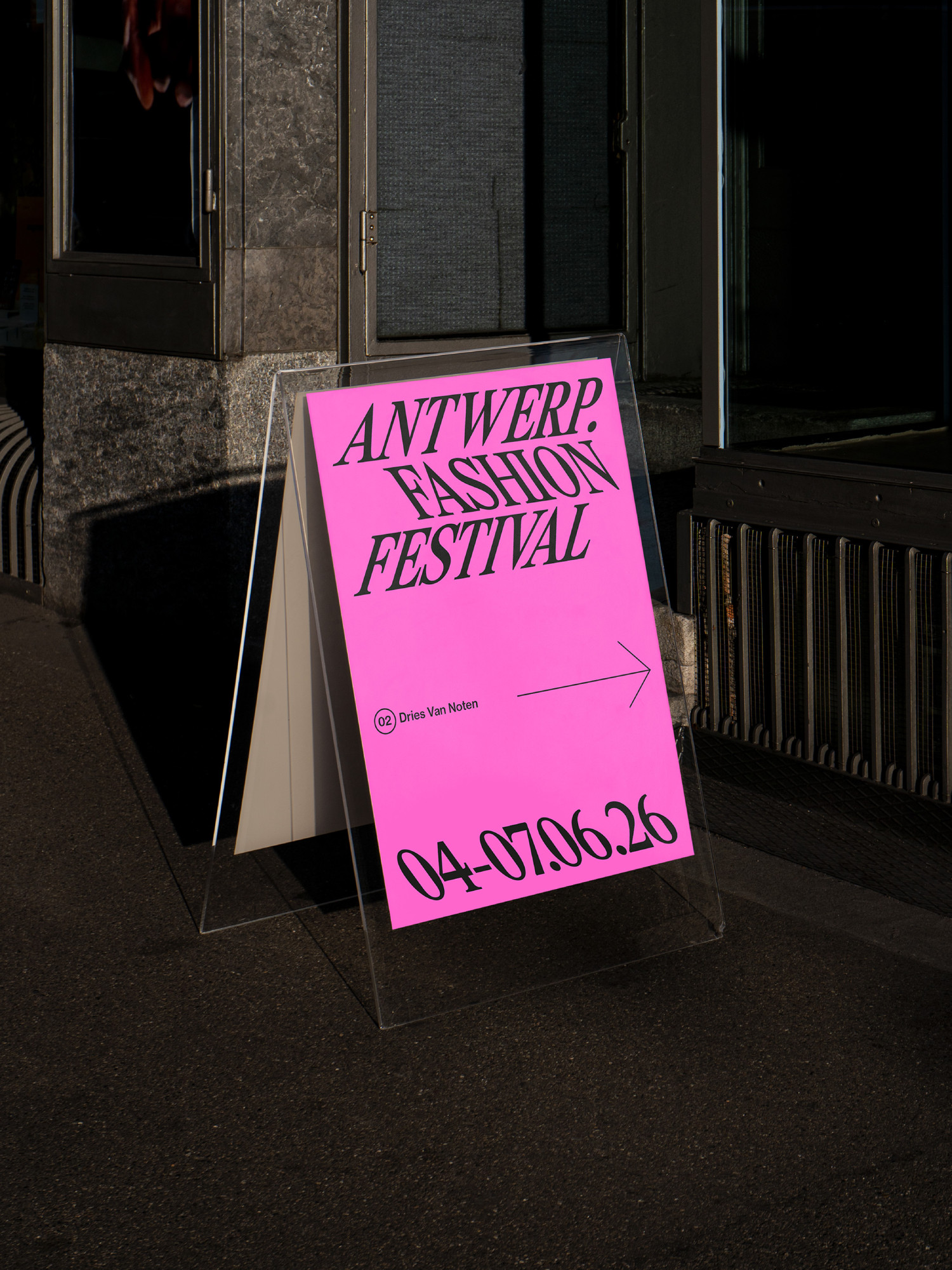
For the first edition of Antwerp.Fashion Festival, we developed a visual identity that translates this mindset into a bold yet refined graphic system. The identity acknowledges Antwerp’s legacy while creating space for a new generation of designers, makers and audiences.
At the heart of the identity is typography. A custom logotype and expressive typographic system alternate between slanted and backslanted compositions, creating a subtle sense of friction and movement. Inspired by the understated rebellion that characterises Antwerp fashion, the system feels precise rather than loud, unexpected rather than decorative. The colour palette follows the same philosophy. A grounded clay tone is paired with vivid accent colours, balancing restraint with energy. Together they create a recognisable visual language that adapts effortlessly across posters, social media, merchandise, signage and motion.
The result is a flexible identity that doesn’t imitate fashion. It behaves like it.
Branding Art Direction Graphic Design Motion Design Brand Guidelines Brand Activation