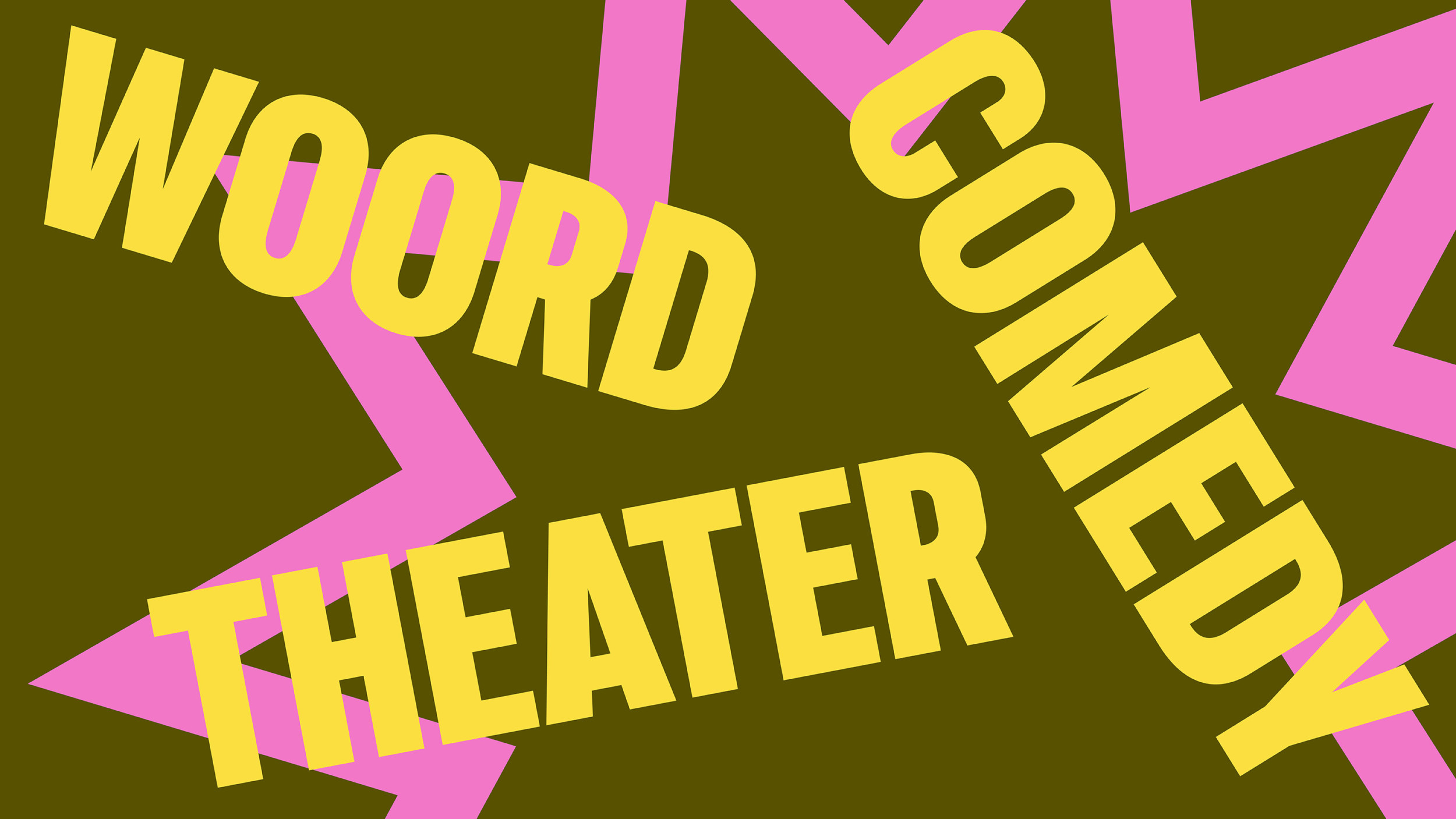
Arenberg is more than just a stage, it’s a driving force in Antwerp’s cultural scene. A home for comedy, cabaret, theater, music, and spoken word, it provides a space where established names and emerging talent collide. But Arenberg is also a connector, extending its reach beyond its own walls with initiatives like OLT Rivierenhof, OLT Club, MAD Festival, and Mad Goat.
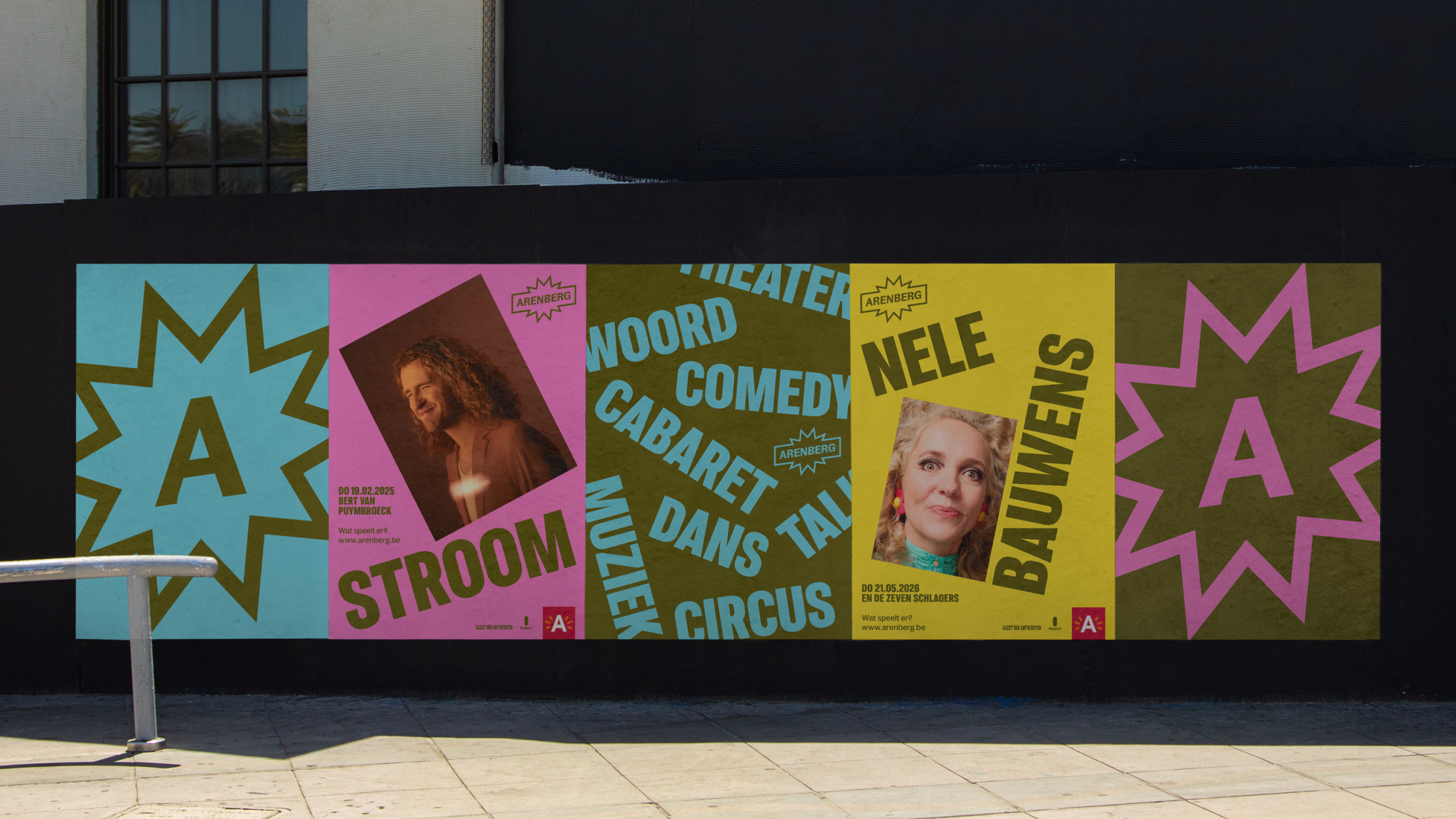
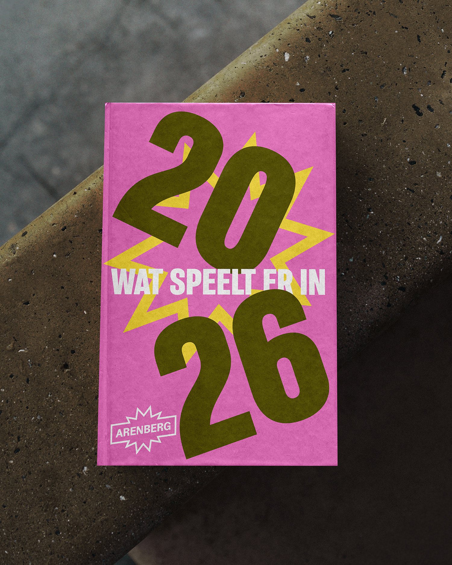
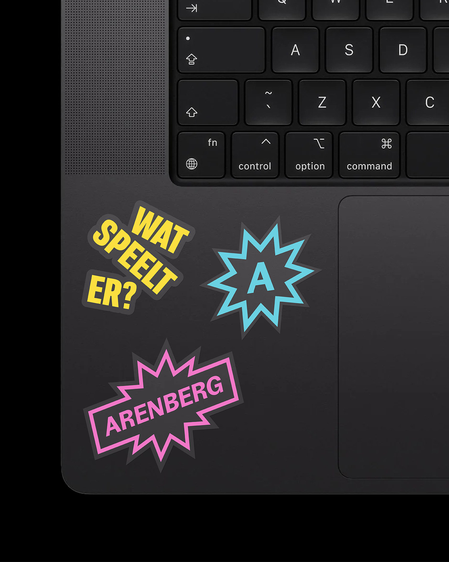
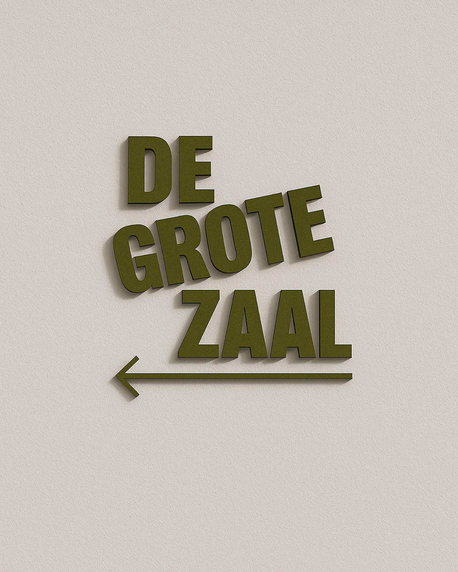
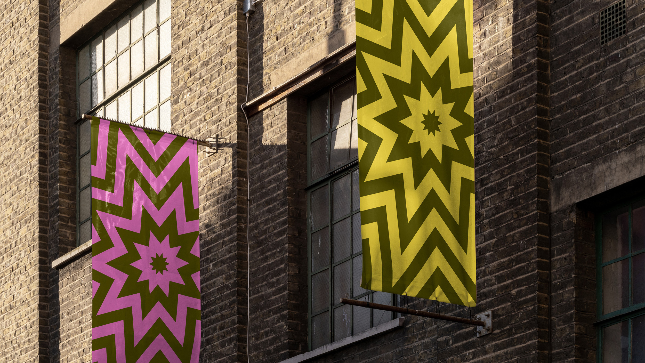
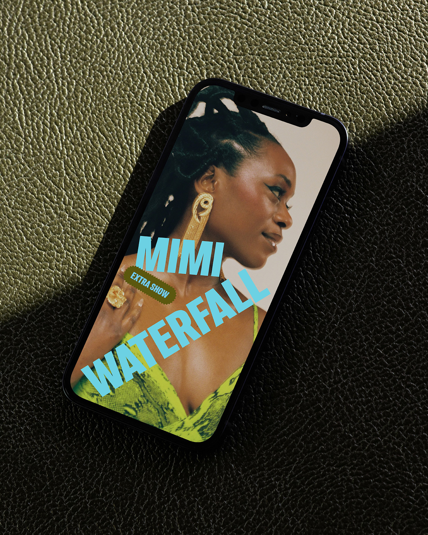
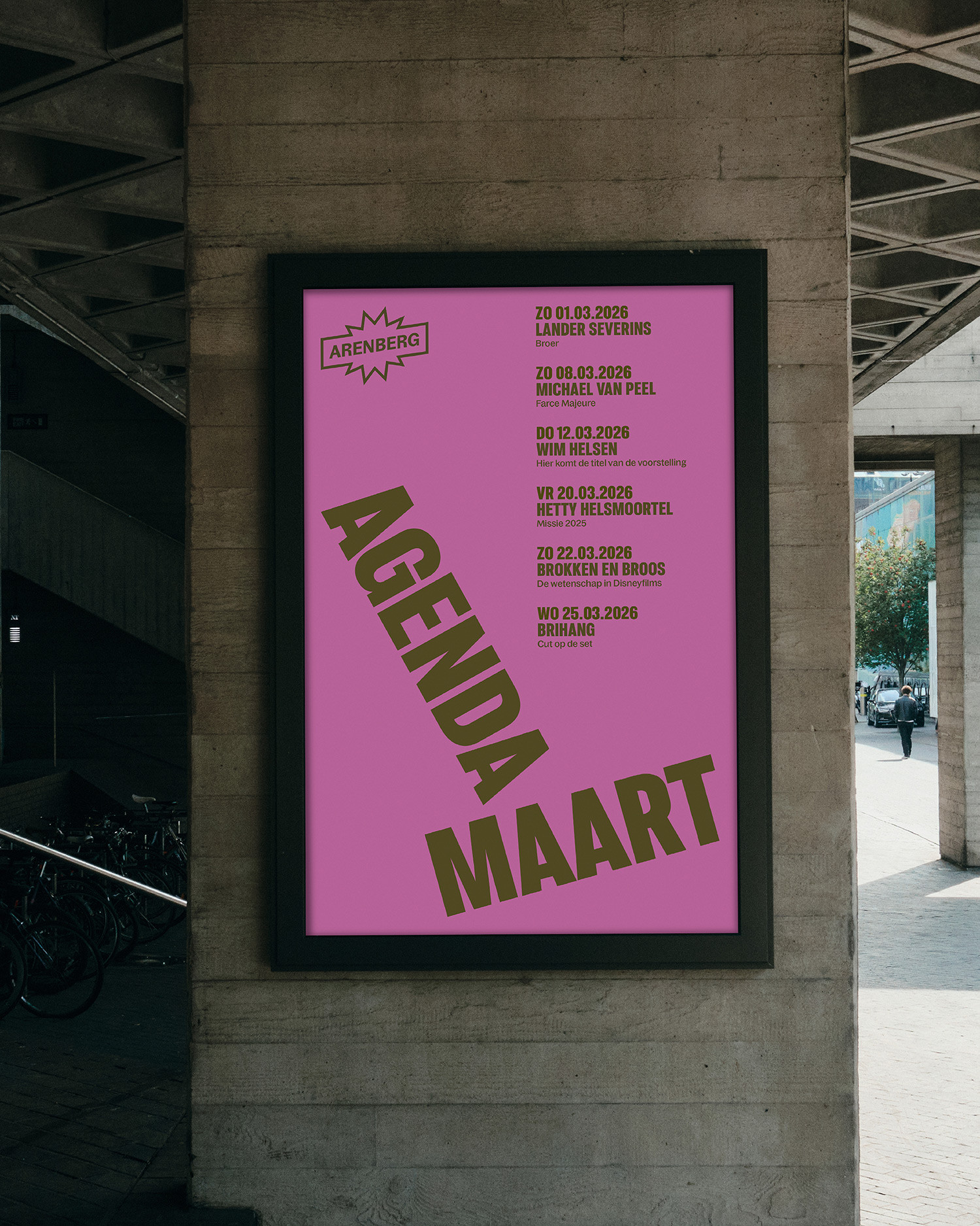
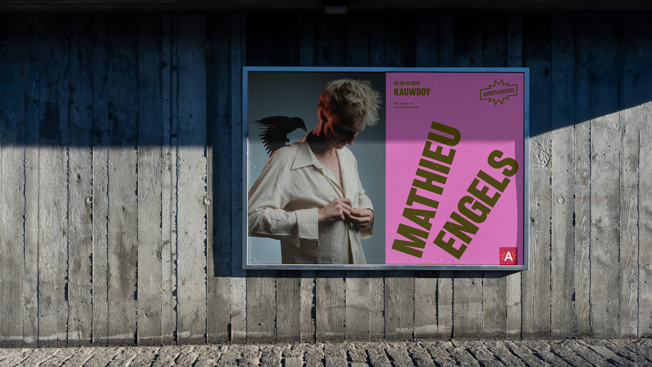
The challenge? Bringing these diverse initiatives together under one cohesive identity, while embedding Arenberg in Stad Antwerpen’s overarching brand architecture. The new identity had to balance two contrasting roles: a neutral foundation that could serve as an enabler for artists and initiatives, and a dynamic, high-energy expression when needed. Rather than introducing an entirely new visual language, we built upon what was already there. The existing logo remained, but the brand was redefined through motion, typography, and color. A flexible typographic system provides a strong backbone, while the visual identity plays with rhythm and movement, always shifting, always in motion. The motion identity introduces a rotating effect, reinforcing the feeling that something is always playing.
This approach allows Arenberg to be both an anchor and an amplifier. Subdued when necessary, loud when it counts. The result is an identity that fuels creativity, fosters connection, and ensures that Arenberg continues to be the beating heart of the performing arts in Antwerp.
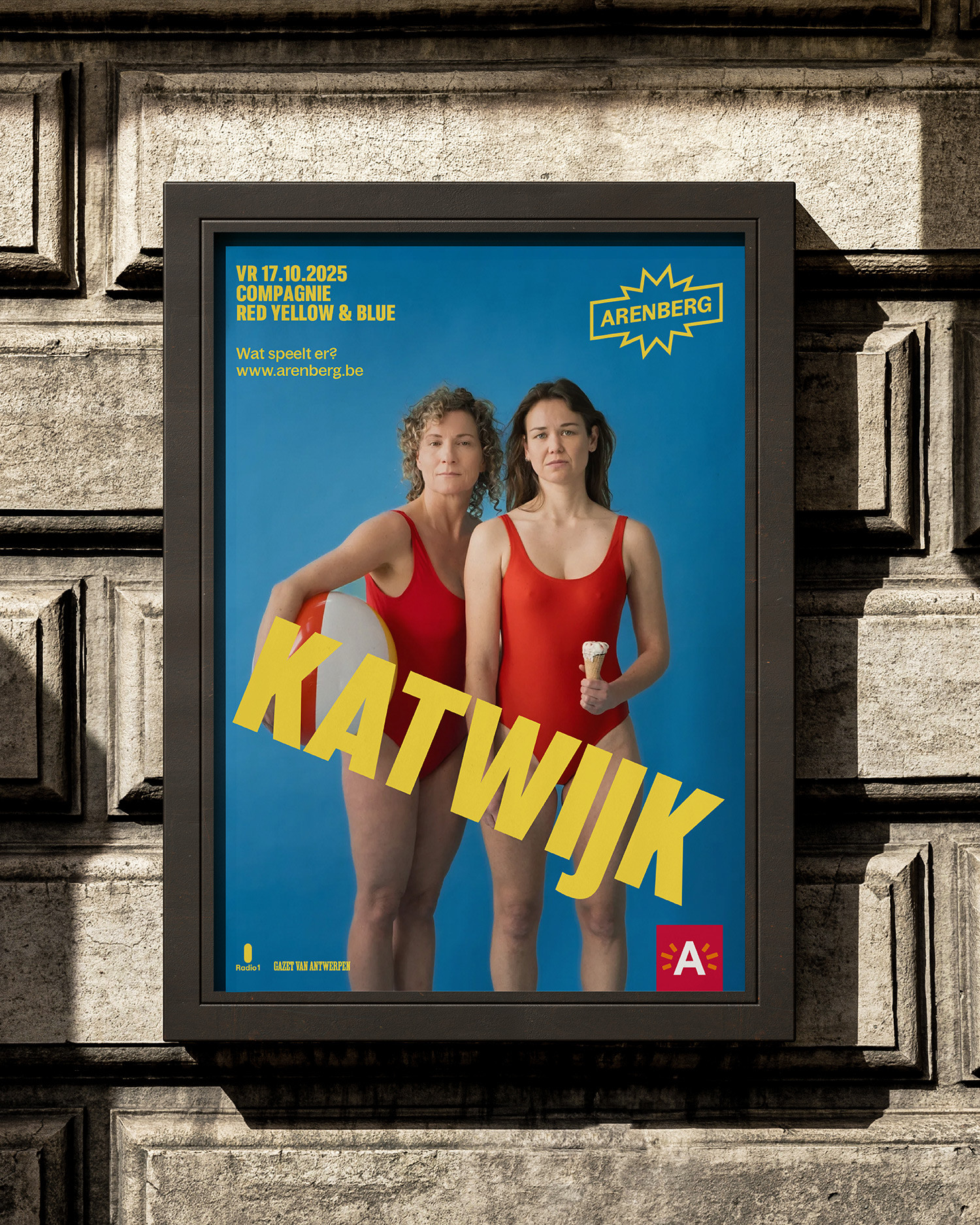
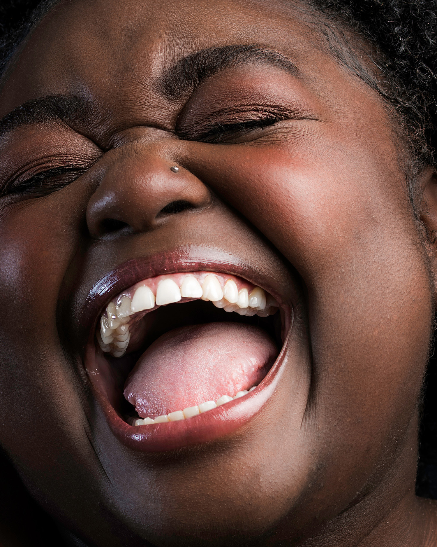
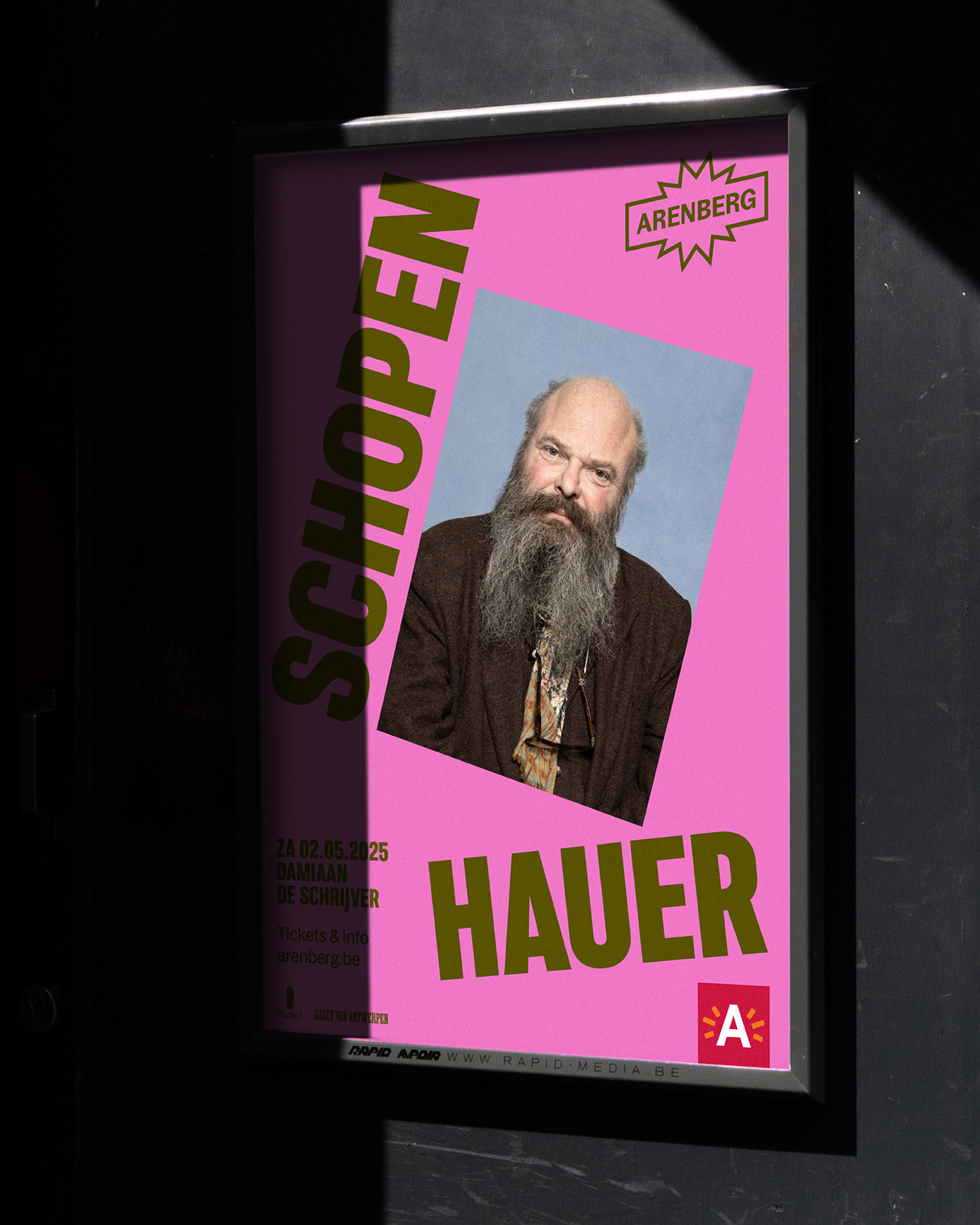
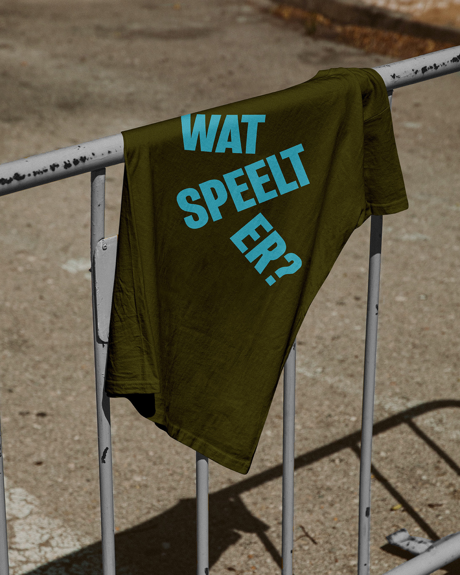
To launch the new season, we created a campaign built around the tagline ‘Wat speelt er?’ (in Dutch a double entendre: what’s playing / what’s going on). The line works on two levels: literally pointing to the program, comedy, cabaret, theater, music, spoken word, circus, but also tapping into the emotions that live inside and outside Arenberg’s walls. Four close-up portraits captured these emotions: the burst of laughter, the sense of wonder, the tearful moment of being moved, and the pure energy of losing yourself in music. By pairing these expressive images with the program words, the campaign not only made the offer tangible, but also highlighted Arenberg as a place where feelings take center stage.
Campaign photography: Noortje Palmers
Graphic Design Motion Design Rebranding Brand Strategy Campaign