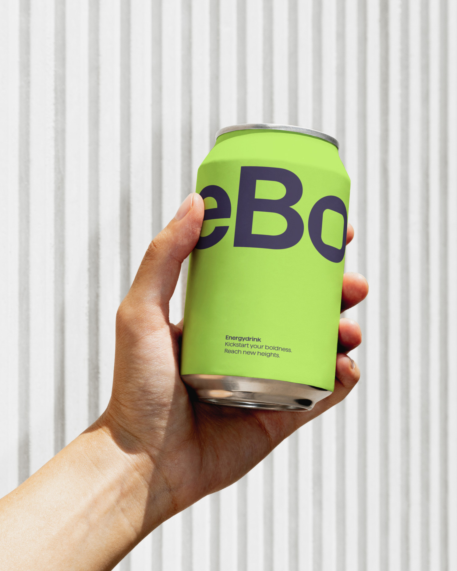
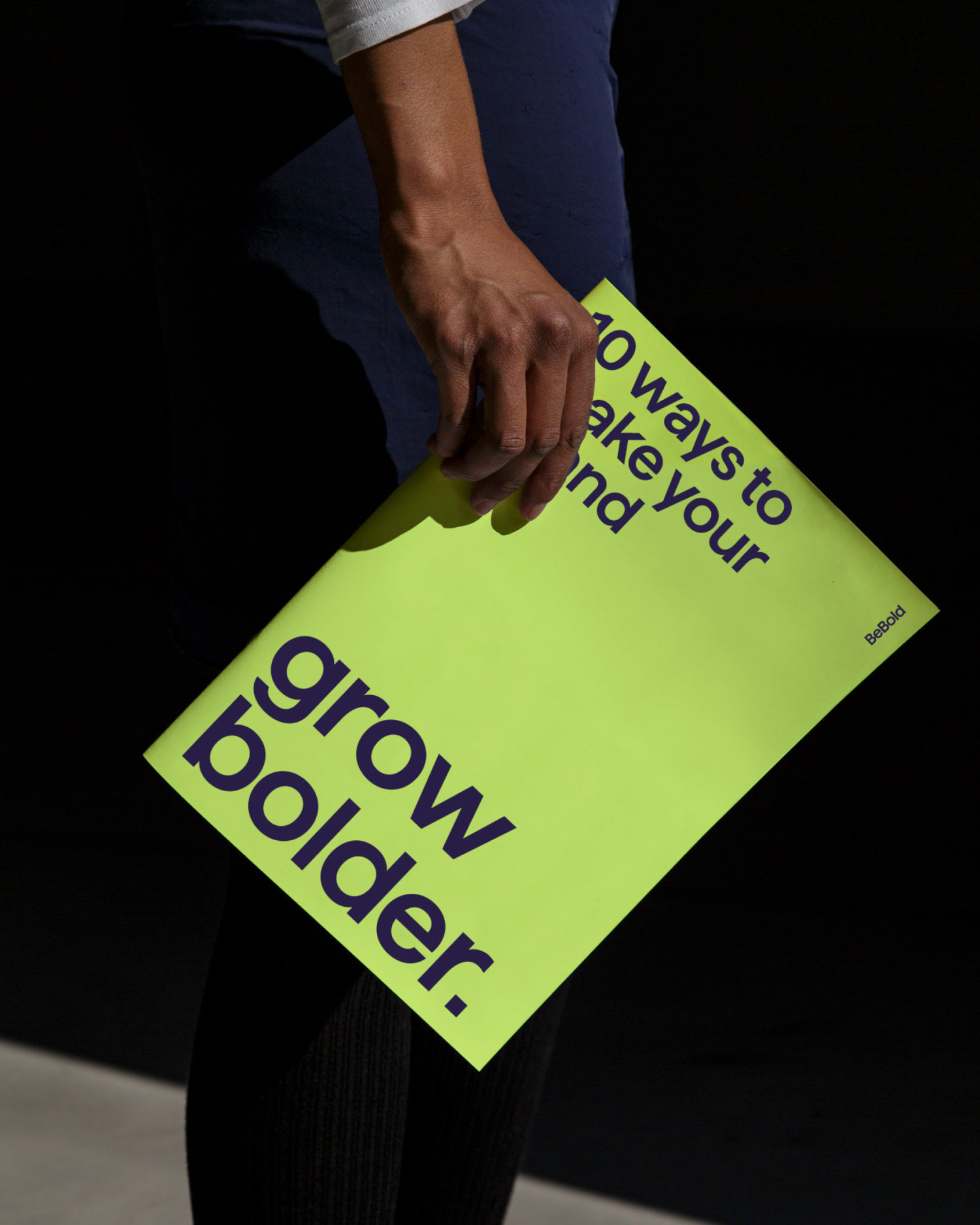
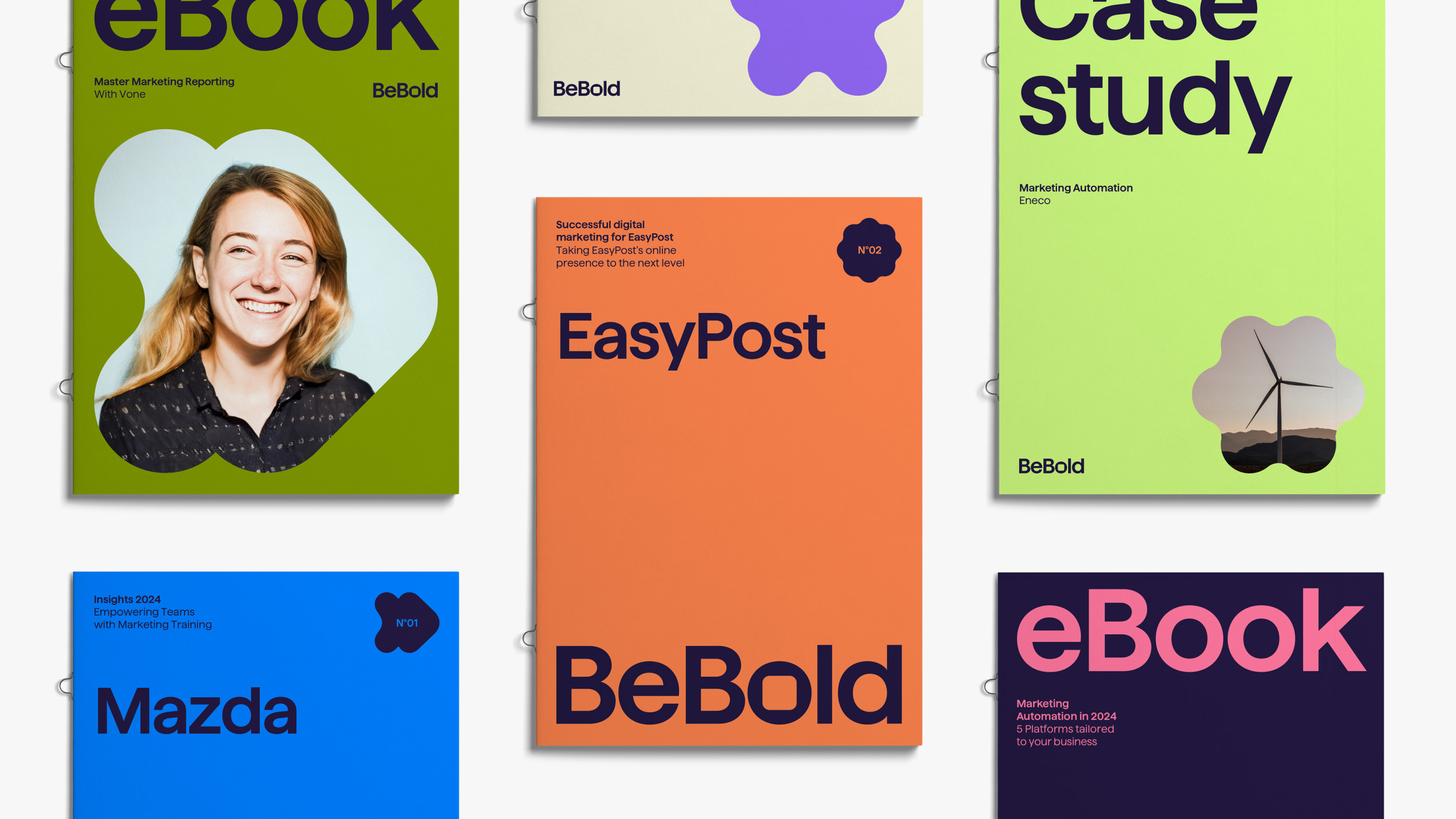
BeBold is a collective of bold thinkers and doers who tailor their services to each client's unique challenges, aiming to create custom solutions that drive business growth. A rebrand capturing their true essence was essential for their continued evolution. BeBold needed a cohesive and compelling brand identity to reflect its unique approach to custom marketing and automation. The goal was to craft a brand that not only resonates with their target audience but also communicates their core values of growth, boldness, and innovation.
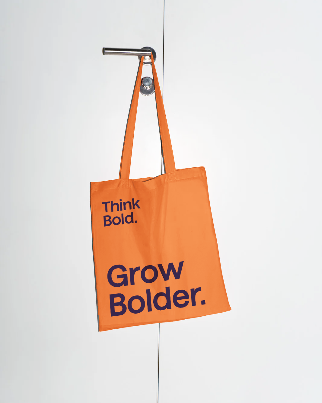
We encapsulated BeBold’s mission with the baseline: “Think bold. Grow bolder.” This phrase captures the essence of challenging standard approaches and striving for smarter, bolder possibilities.
The visual identity is driven by eight key characteristics: Growth, Challenging, To the Point, Confident, Trustworthy, Energetic, Expertise, and Approachable. These attributes guide all design choices and are woven throughout BeBold’s brand experience.
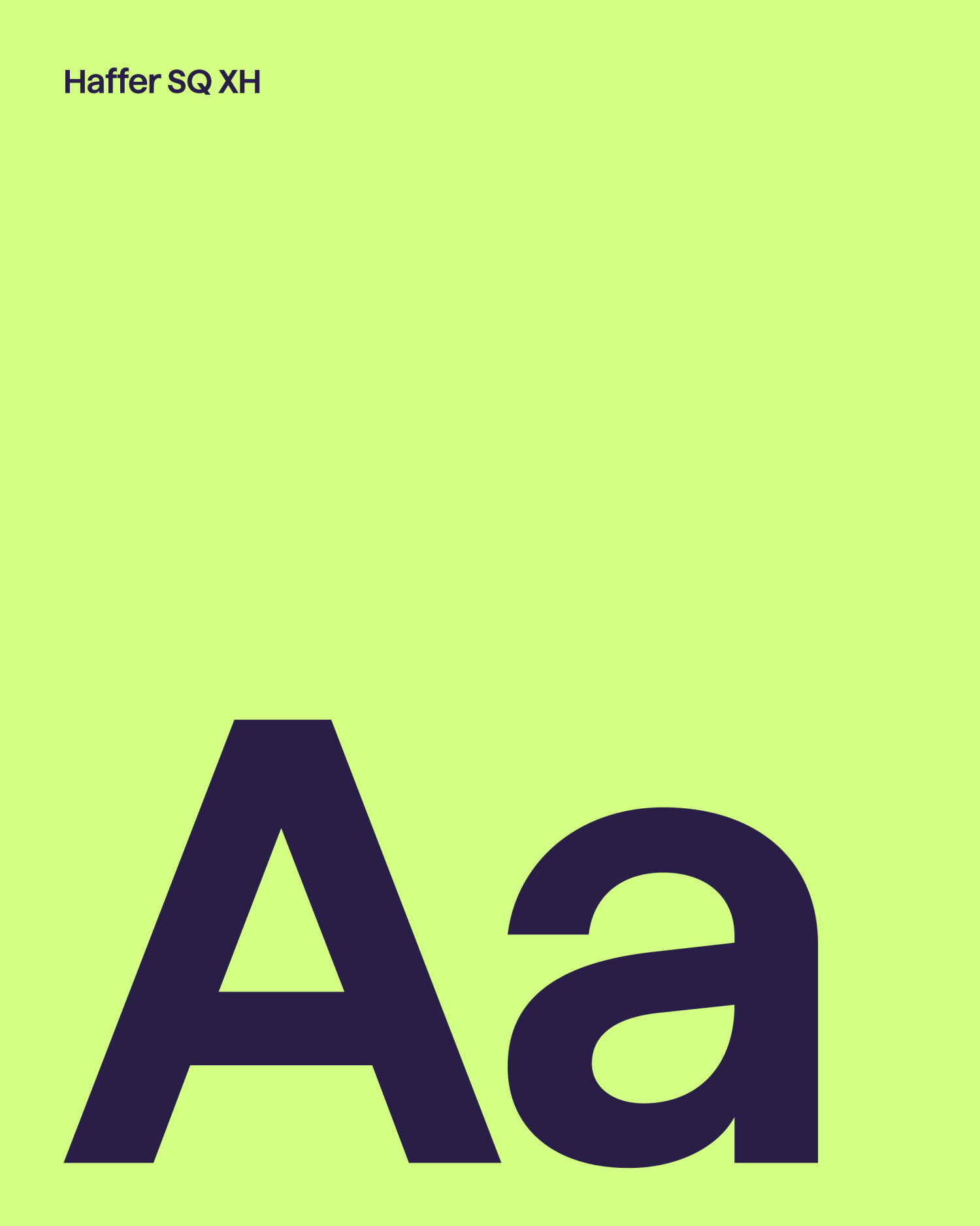
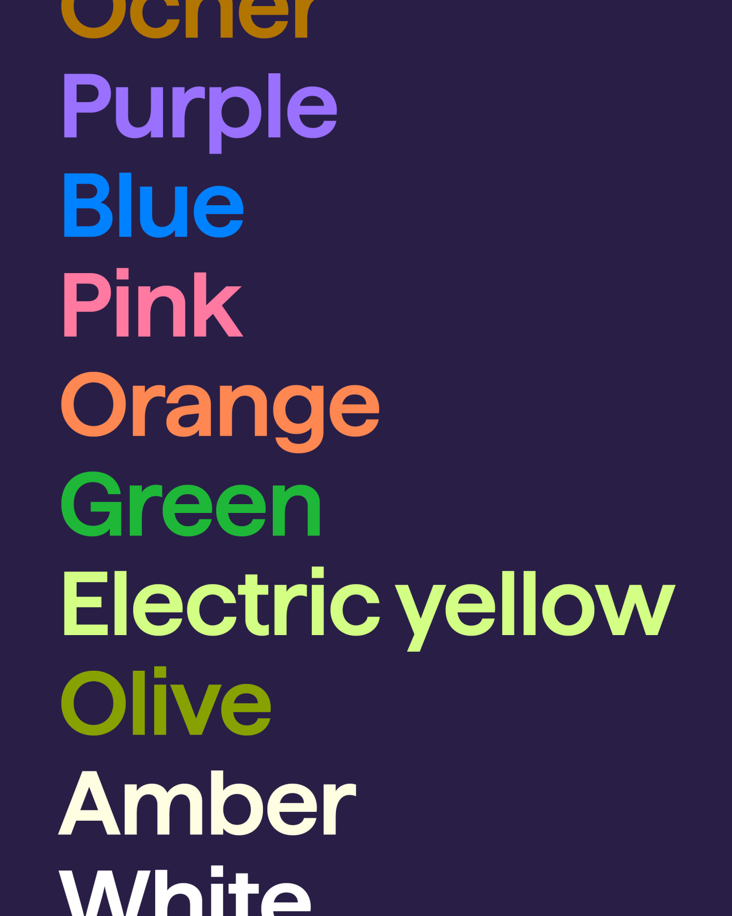
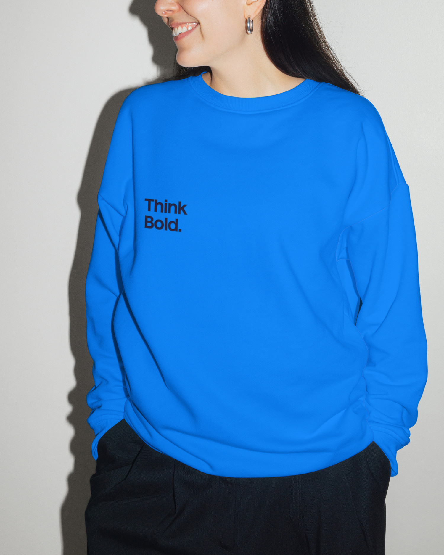
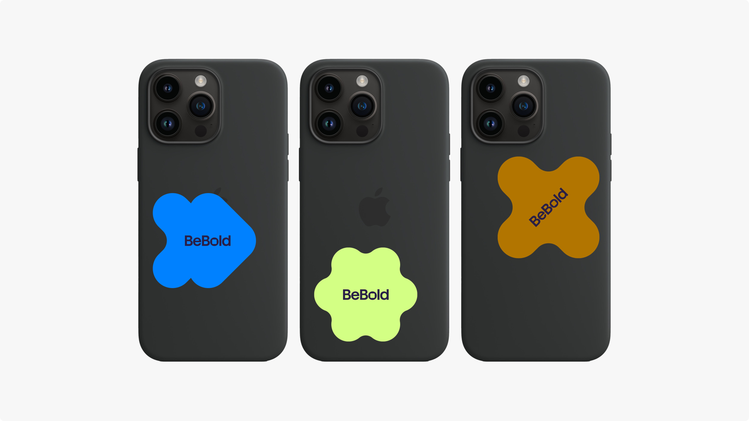
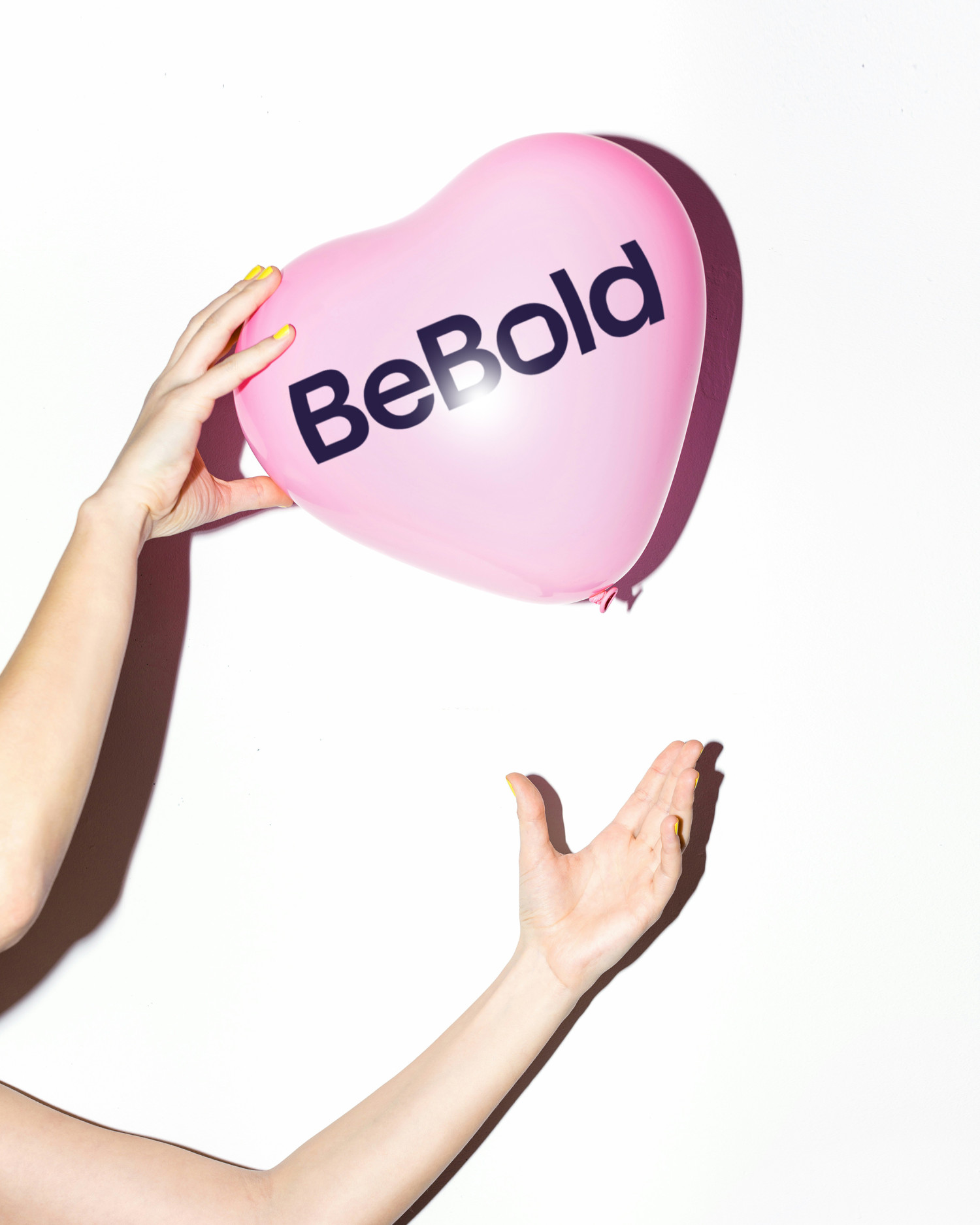
The new wordmark logo is bold and straightforward, symbolizing BeBold’s confident approach. The inner shape of the 'o' represents the beginning of a transformation, aligning with our graphical language focused on growth. We created a wide and vibrant color palette that embodies their energetic spirit. This is complemented by Haffer SQ XH, a modern sans-serif typeface selected for its balanced geometry and solid feel. It's bold yet approachable, perfectly conveying the brand’s message without being flashy. The set of graphic shapes are smooth and round, giving them an accessible and friendly feel. These shapes, evolving from the inner 'o' of the logo to a full circle, symbolize continuous growth. The feel can also be found in typographic layouts and the motion language as well. BeBold’s photographic style uses direct flash and saturated colors to create a hyperreal, candid aesthetic—an approach that emphasizes honesty and transparency.
Branding Brand Strategy Brand Architecture Motion Design
