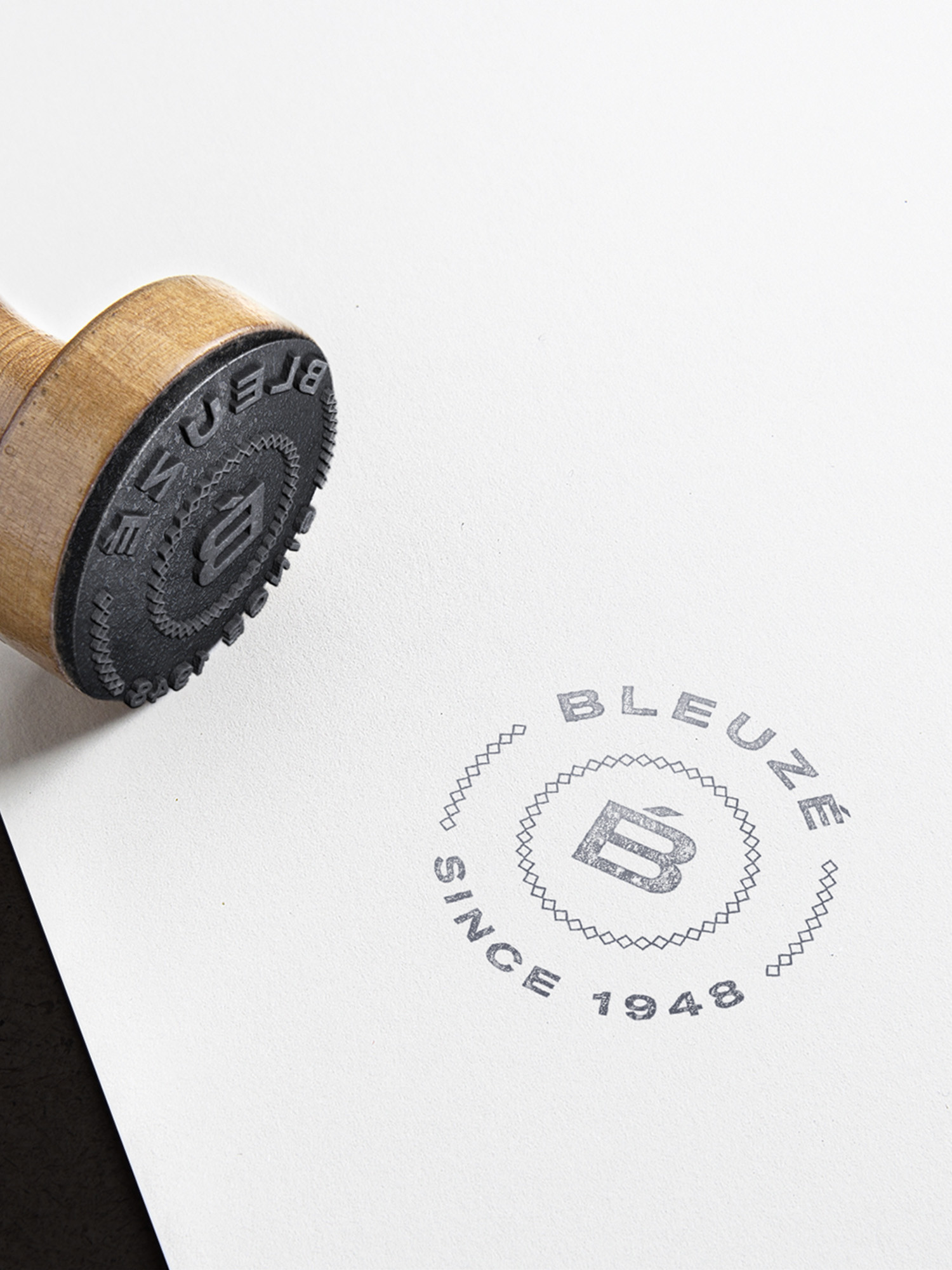
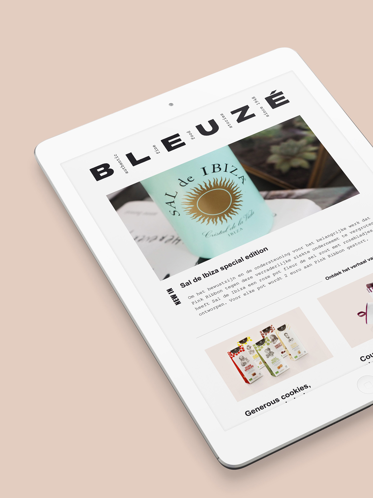
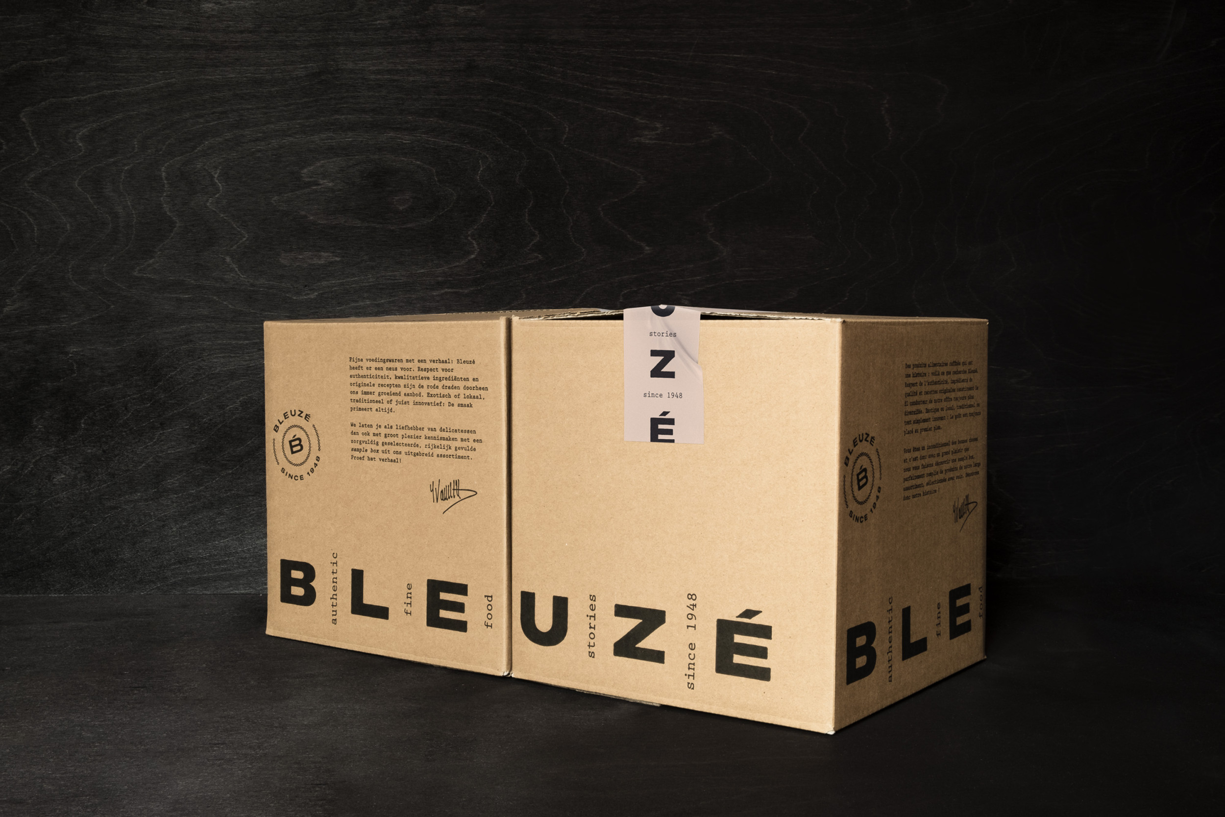
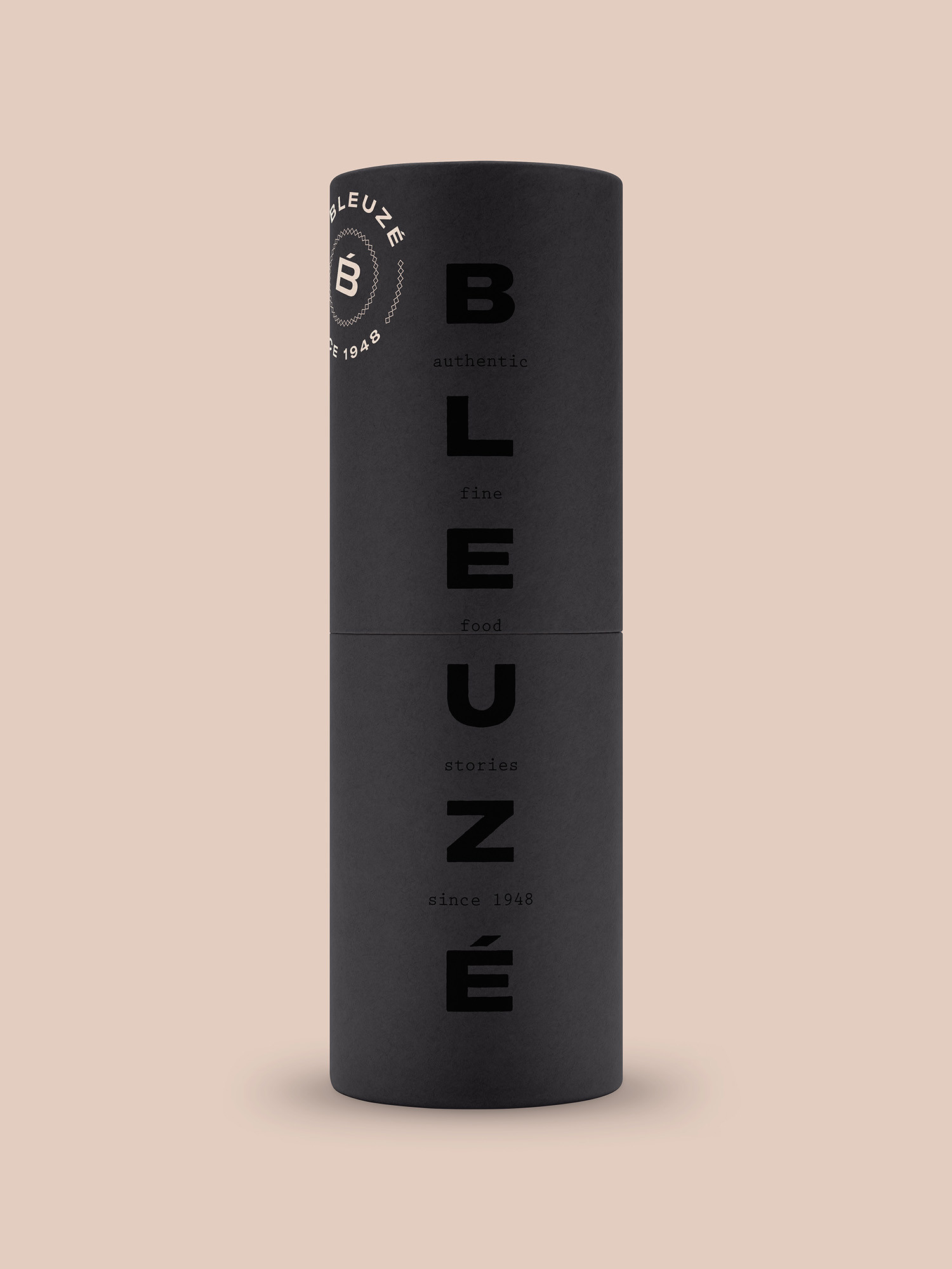
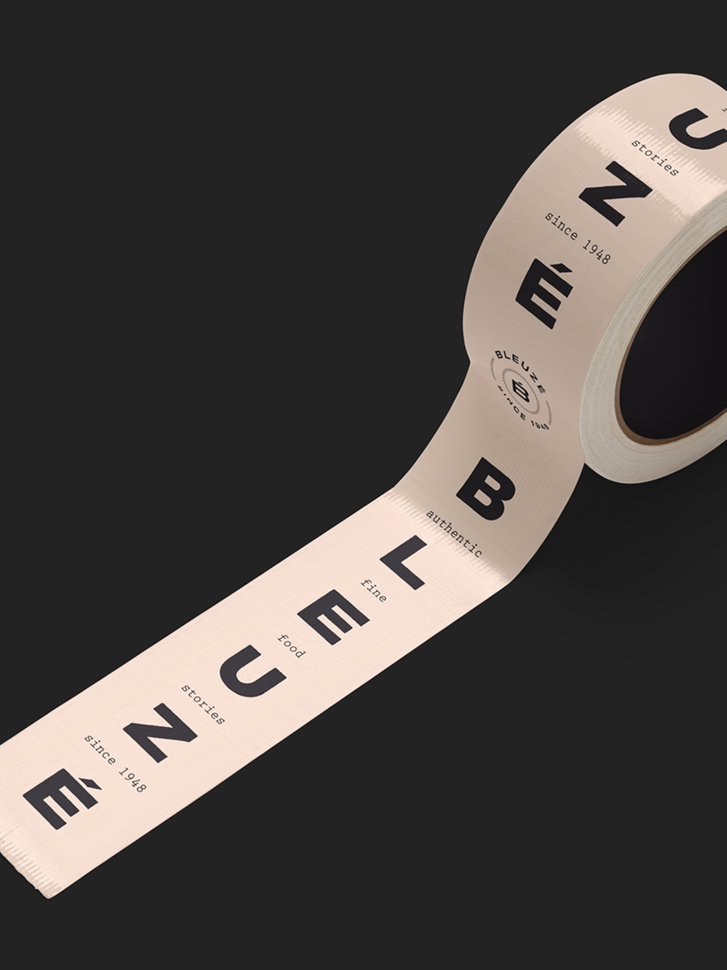
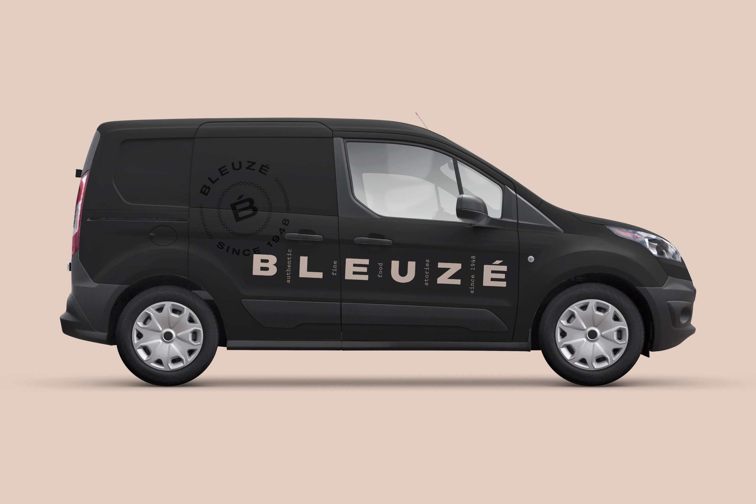
Fine food stories deserve a fine visual identity. The family-run fine foods broker Bleuzé, established in 1948, needed an update of its visual identity to personify their rich and extremely tasty assortment of delicacies from around the world. To reflect the character of the premium yet very artisanal and authentic range we proposed a visual identity that’s both contemporary and rooted in tradition, with the dynamically applicable logotype + baseline symbolising a timeline documenting the heritage of the brand.
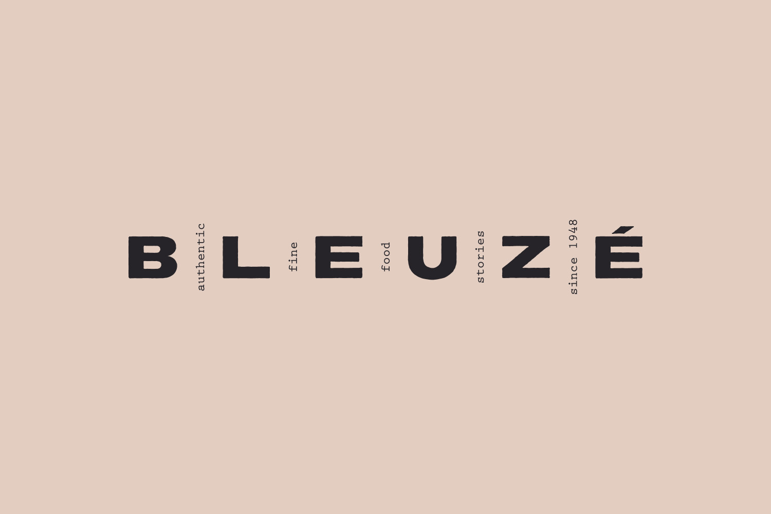
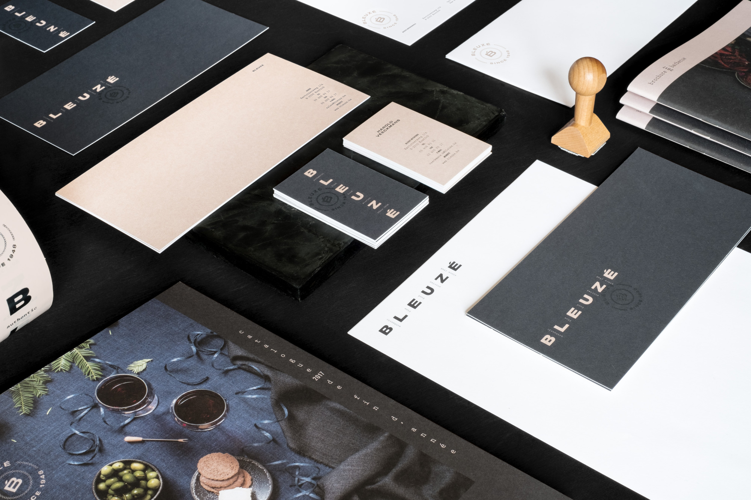
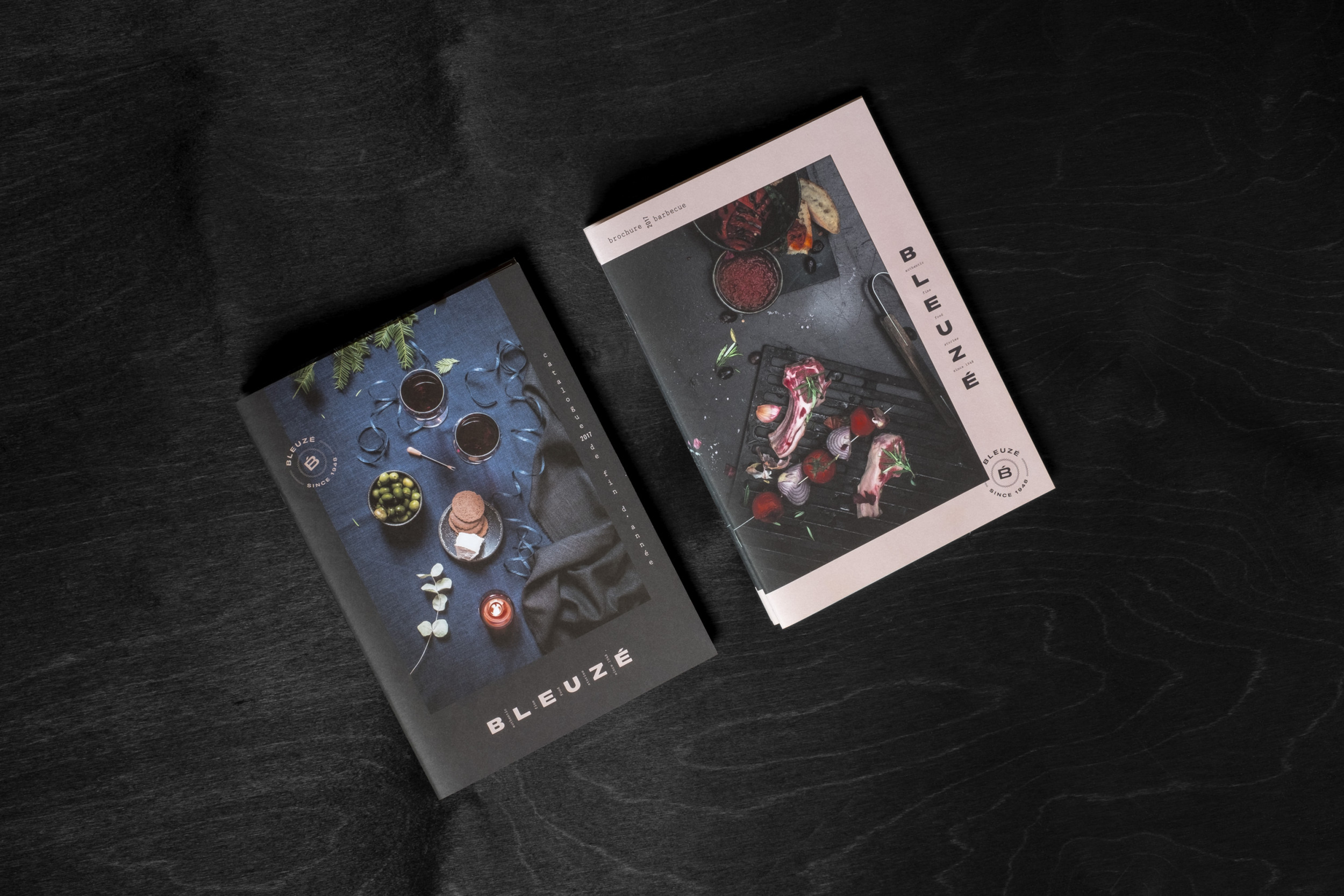
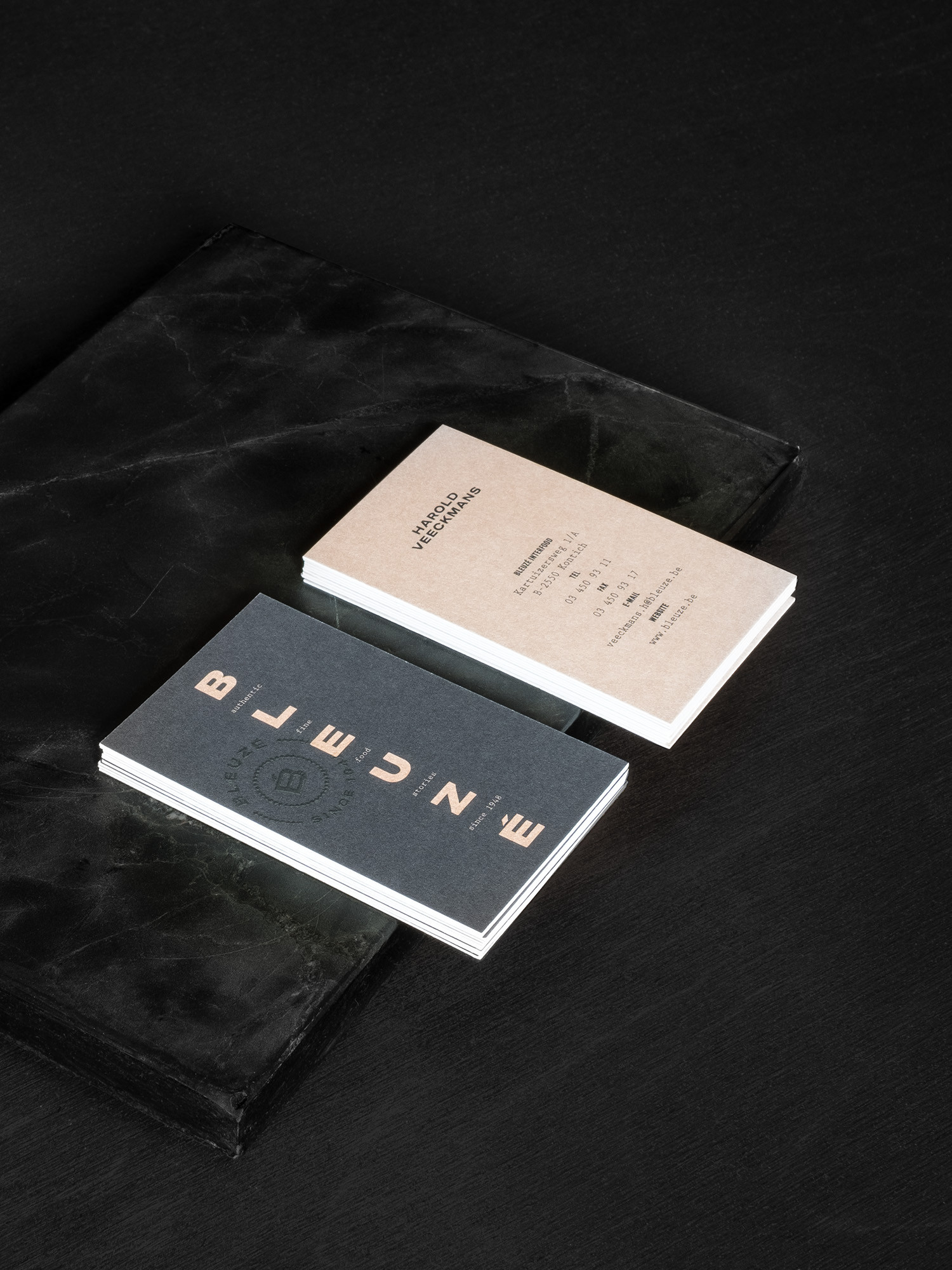
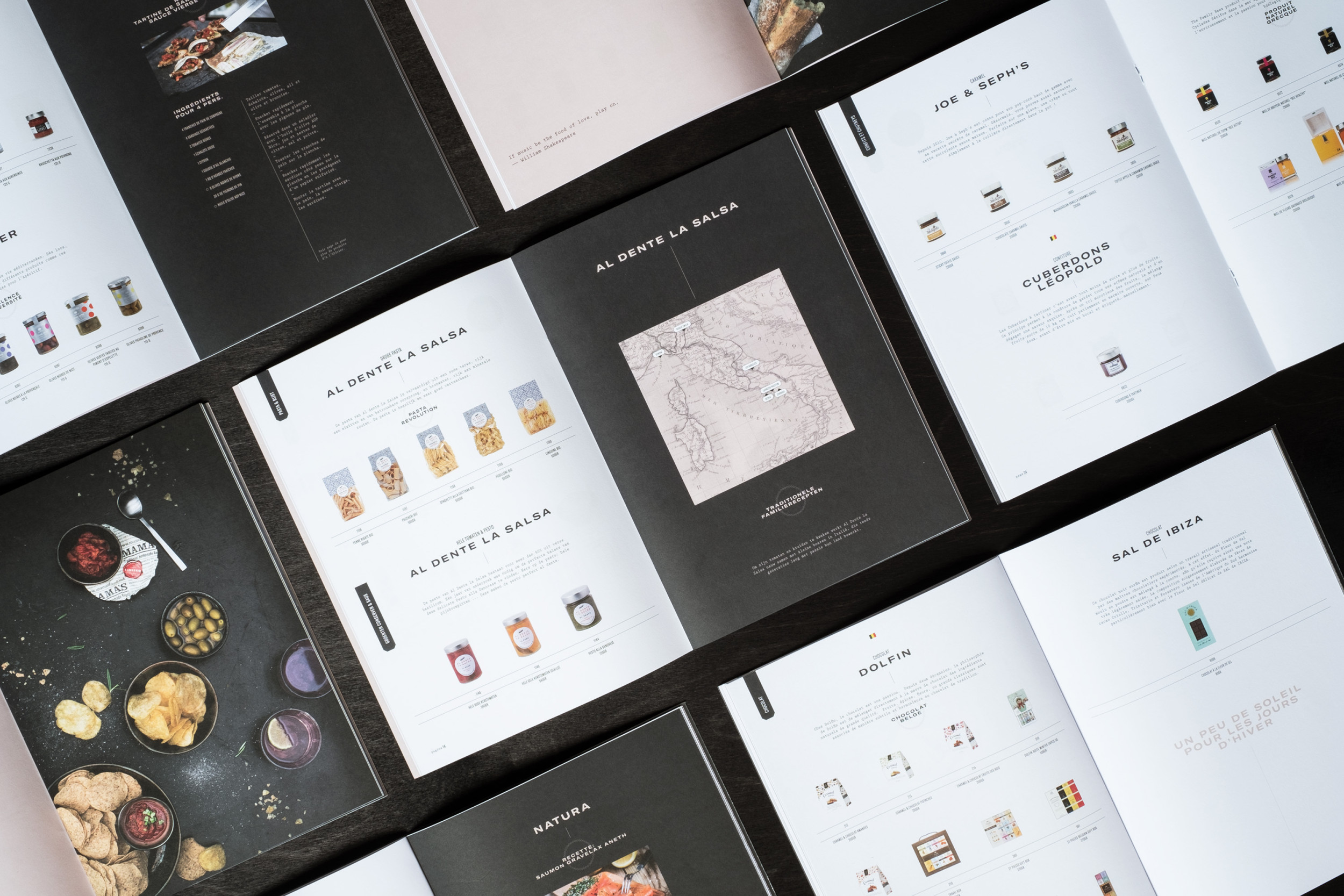
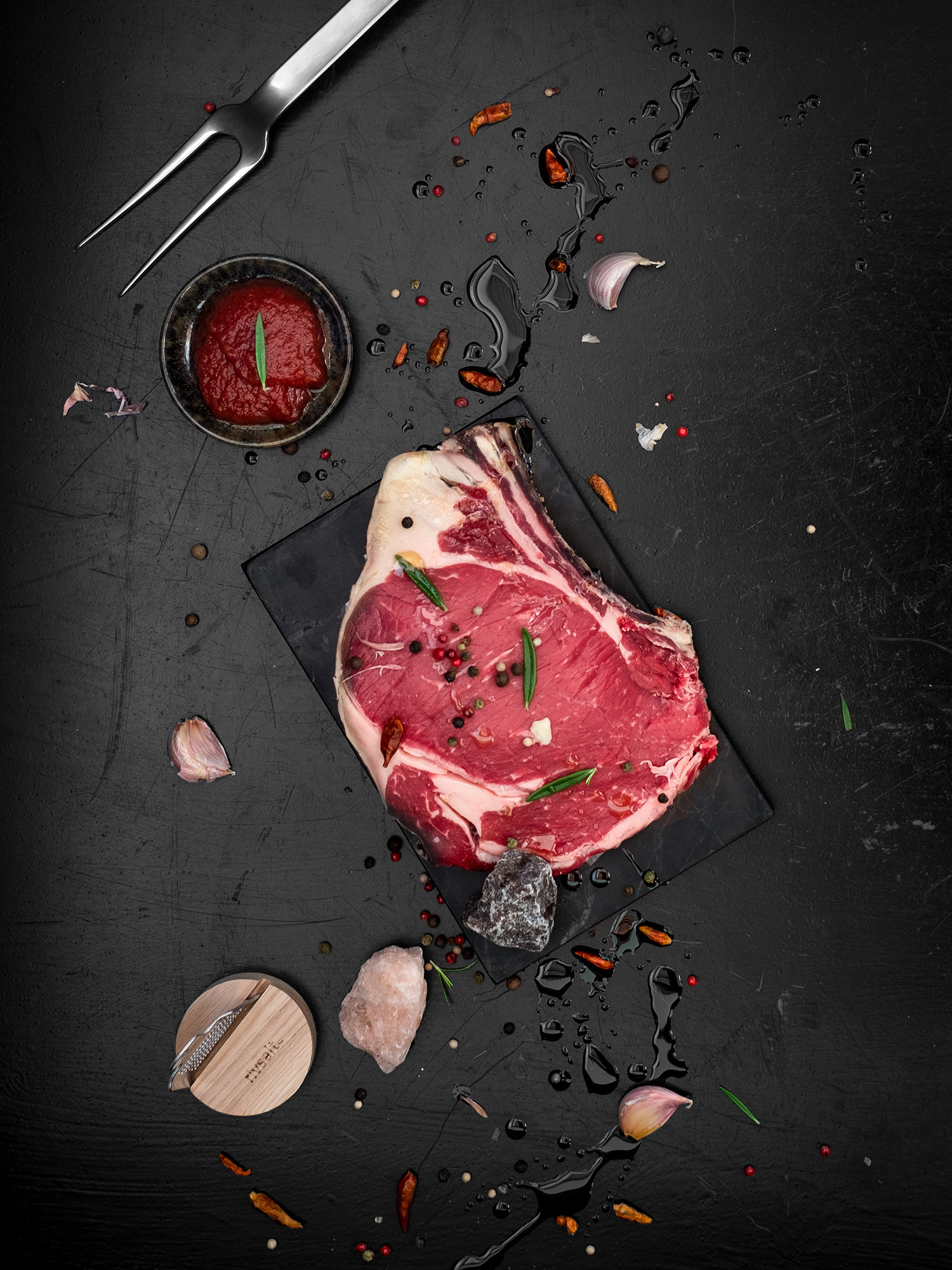
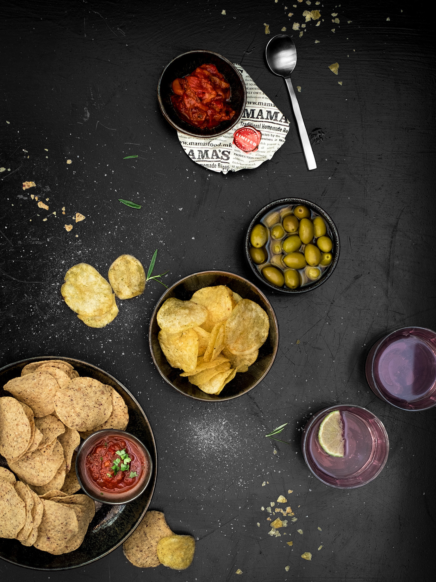
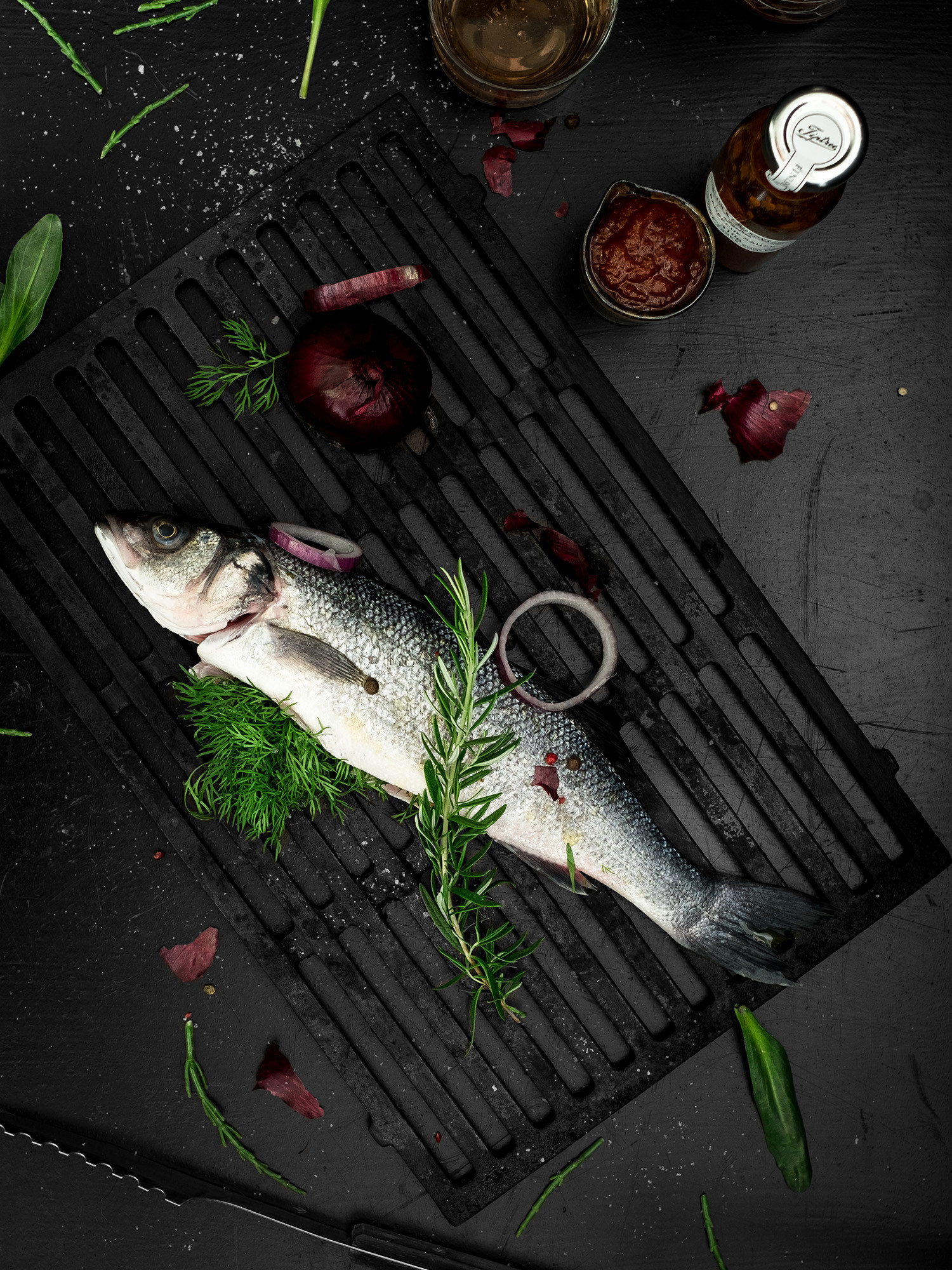
Next to a refined yet clear logo we installed a new tagline ‘fine food stories since 1948’ to highlight the rich history of the company’s expertise. The graphical element of a stamp emphasizes the quality and fine selection of all products selected, savoured and distributed by Bleuzé. The visual identity was rolled out on all existing communication tools such as stationery, packaging and catalogues. In addition to the visual identity and design of the catalogue we did in-house food styling and set photography for thematic imagery used in the BBQ catalogue sales tool.
Rebranding Photography Art Direction Copywriting